


- Détruisez cette brute folle Poster
- Shaw ou l'ironie Poster
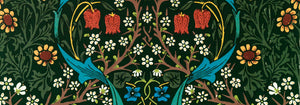
- Les Lalanne Poster
- Punch Boutique Poster
- Judaism and Paganism Standpoint Poster
- Clipper à réaction à destination d'Hawaii Poster
- Campari Soda Poster
- Bec-Kina Poster
- Scène de rue de Berlin Poster
- Exposition Ernst Kirchner Poster
- Tour Eiffel 2 Poster
- Femme assise de dos Poster
- Parc près de Lu Poster
- El Comienzo Poster
- Parler Seul 2 Poster
- Le point de vue actuel des Mahatmas Poster
- Twilight's Ring Poster
- Parler Seul Poster
- Le Rêve Poster
- Le Concert Poster
- Oiseau traversant un nuage Poster
- Femme artiste Poster
- La revanche de Pink Panther Poster
- Femme et oiseau la nuit Poster
- Riley Blaze Poster
- Almanaque Poster
- Bauhaus 20 Poster
- Bauhaus 21 Poster
- Mangez plus de fruits Poster
- Grue japonaise bleue Poster
- Snoopy Come Home Poster
- Vers Londres en Jet Clipper Poster
- La Paresse Poster
- Xerez Pedro Domecq Poster
- Balsam Aperitif Poster
- Crans-sur-Sierre Poster
-
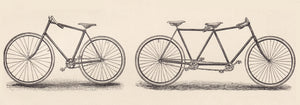
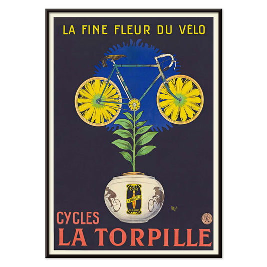
Cycles La Torpille Poster
Mich · 1923 · affiche cycliste fleurie aux couleurs Art Deco franches
Poster dès €9 · Encadré dès €16
Prix habituel À partir de €6,00Prix habituel -
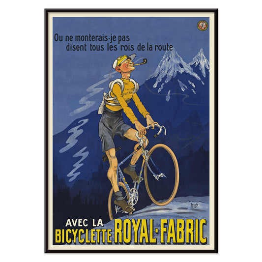
Bicyclette Royal-Fabric Poster
Michel Liebeaux · 1922 · poster vintage de bicyclette avec cycliste en montée et lettrage Royal-Fabric
Poster dès €9 · Encadré dès €16
Prix habituel À partir de €6,00Prix habituel -
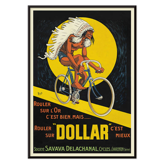
Bicyclettes Dollar Poster
Michel Liebeaux · 1922 · poster audacieux avec un cycliste lancé dans un cercle jaune lumineux
Poster dès €9 · Encadré dès €16
Prix habituel À partir de €6,00Prix habituel -
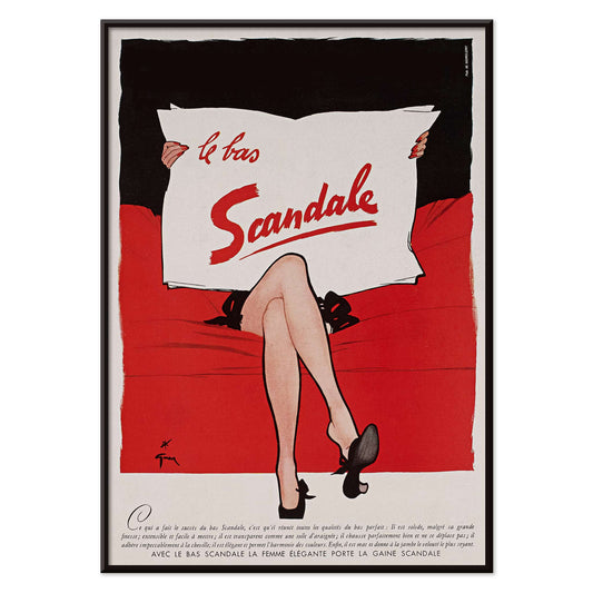
Le bas scandale Poster
Paul Iribe · 1920 · poster vintage rouge, noir et blanc au message de mode audacieux
Poster dès €9 · Encadré dès €16
Prix habituel À partir de €6,00Prix habituel -
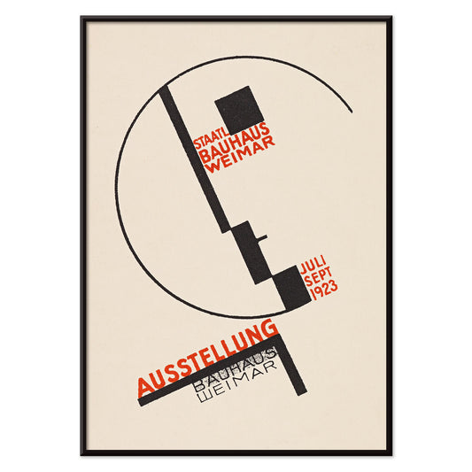
Exposition Bauhaus à Weimar Poster
Dörte Helm · 1923 · poster Bauhaus aux formes géométriques fortes et lettrage rouge sur fond beige
Poster dès €9 · Encadré dès €16
Prix habituel À partir de €6,00Prix habituel -
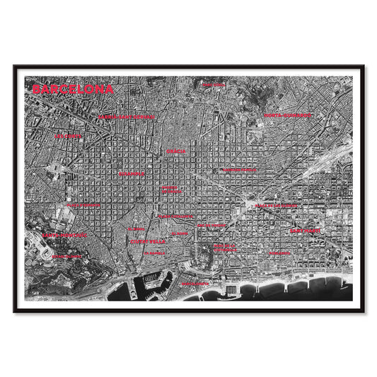
Carte satellite de Barcelone Poster
MORYARTY · 2026 · poster de carte satellite de Barcelone avec quartiers en rouge et littoral
Poster dès €9 · Encadré dès €16
Prix habituel À partir de €6,00Prix habituel -
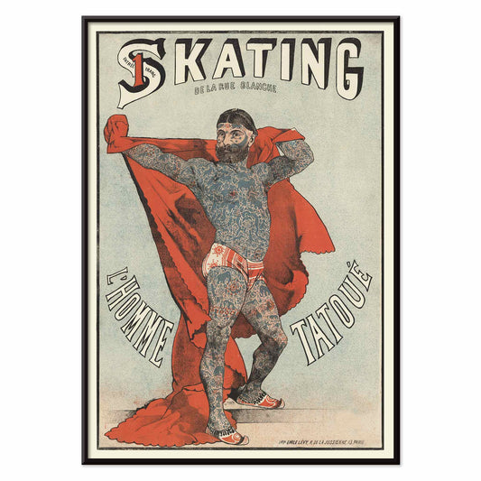
Skating de la Rue Blanche Poster
Émile Lévy · 1879 · impression vintage d'un homme tatoué devant un rideau rouge
Poster dès €9 · Encadré dès €16
Prix habituel À partir de €6,00Prix habituel -
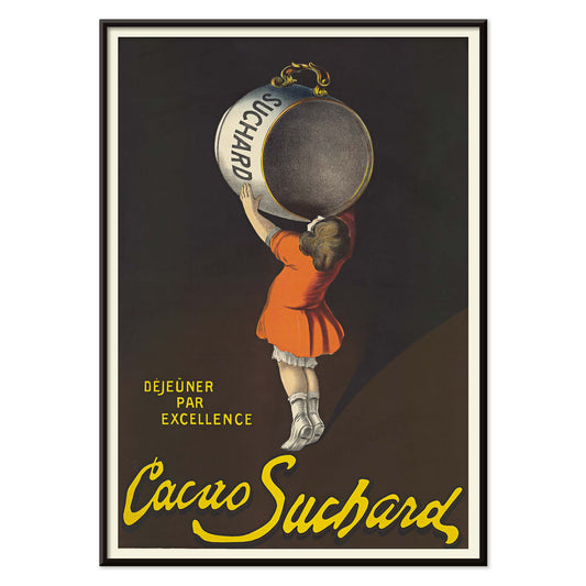
Cacao Suchard Poster
Leonetto Cappiello · 1911 · poster vintage au contraste théâtral, avec la boîte Suchard surdimensionnée
Poster dès €9 · Encadré dès €16
Prix habituel À partir de €6,00Prix habituel -
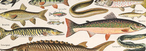
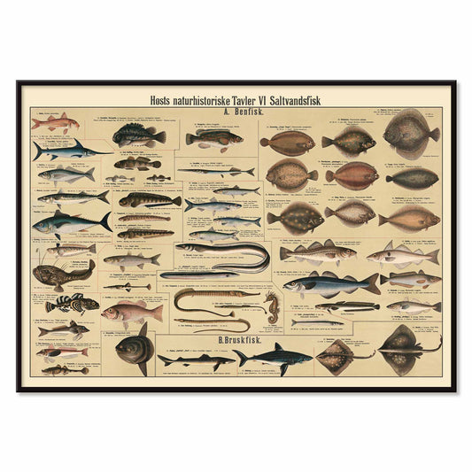
Planche de poissons d'eau salée Poster
Dr. W. Raschke · 1909 · impression scientifique détaillée de poissons d'eau salée sur fond beige chaleureux
Poster dès €9 · Encadré dès €16
Prix habituel À partir de €6,00Prix habituel -
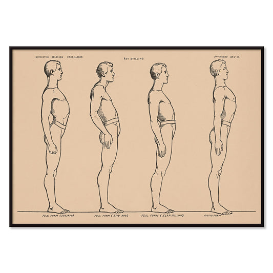
Étude de posture debout Poster
N.C. Roms · 1906 · impression scientifique de quatre études de posture debout sur fond beige
Poster dès €9 · Encadré dès €16
Prix habituel À partir de €6,00Prix habituel -
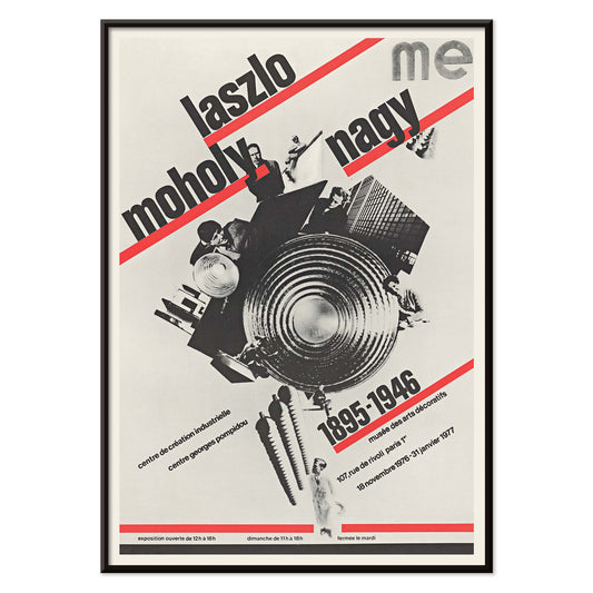
László Moholy-Nagy Poster
Roman Cieślewicz · 1976 · poster Bauhaus aux diagonales typographiques et au cœur de collage noir
Poster dès €9 · Encadré dès €16
Prix habituel À partir de €6,00Prix habituel -
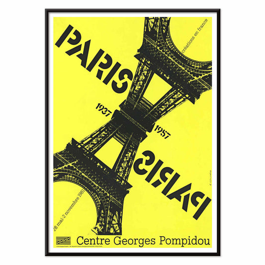
Paris-Paris 1937-1957 Poster
Roman Cieślewicz · 1981 · poster parisien, Tour Eiffel en miroir et contraste jaune marqué
Poster dès €9 · Encadré dès €16
Prix habituel À partir de €6,00Prix habituel -
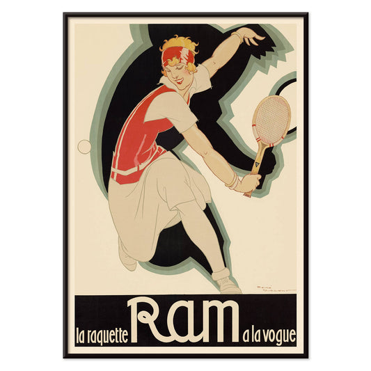
La raquette Ram à la vogue Poster
René Vincent · 1926 · poster vintage avec joueuse de tennis et lettrage Ram affirmé
Poster dès €9 · Encadré dès €16
Prix habituel À partir de €6,00Prix habituel -
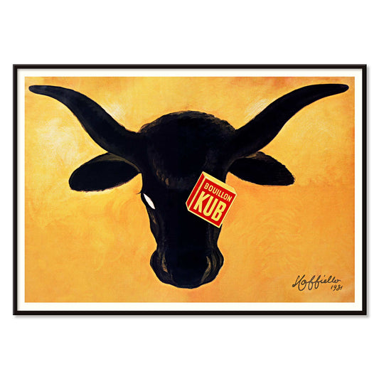
Bouillon Kub Poster
Leonetto Cappiello · 1931 · poster Bouillon Kub avec taureau noir sur fond orange vibrant
Poster dès €9 · Encadré dès €16
Prix habituel À partir de €6,00Prix habituel -
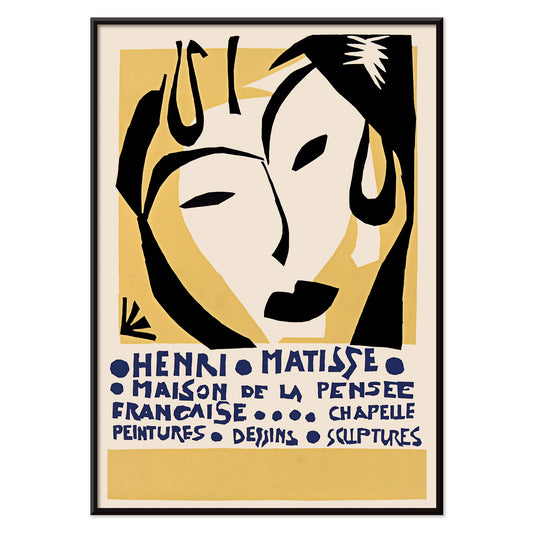
Maison de la Pensée française Poster
Henri Matisse · 1950 · poster d'exposition au visage de masque et à la typographie bleue
Poster dès €9 · Encadré dès €16
Prix habituel À partir de €6,00Prix habituel -
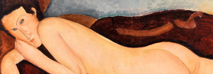
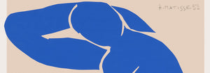
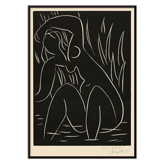
L'après-midi Poster
Henri Matisse · 1941 · impression d'art minimaliste d'une figure allongée sur fond noir
Poster dès €9 · Encadré dès €16
Prix habituel À partir de €6,00Prix habituel -
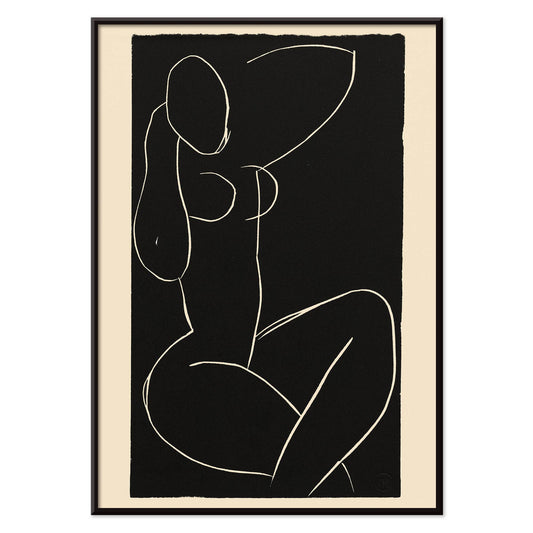
Nu assis aux jambes croisées I Poster
Henri Matisse · 1941 · une impression minimaliste d'un nu assis aux jambes croisées en noir et blanc
Poster dès €9 · Encadré dès €16
Prix habituel À partir de €6,00Prix habituel -
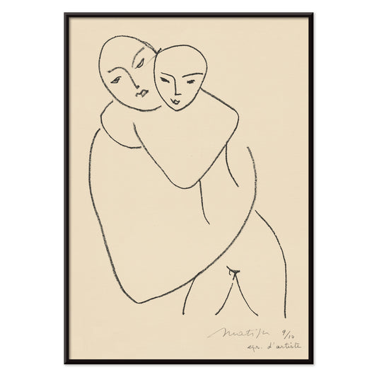
Vierge et enfant Poster
Henri Matisse · 1950 · impression d'art minimaliste d'une mère et son enfant en fin trait noir
Poster dès €9 · Encadré dès €16
Prix habituel À partir de €6,00Prix habituel -
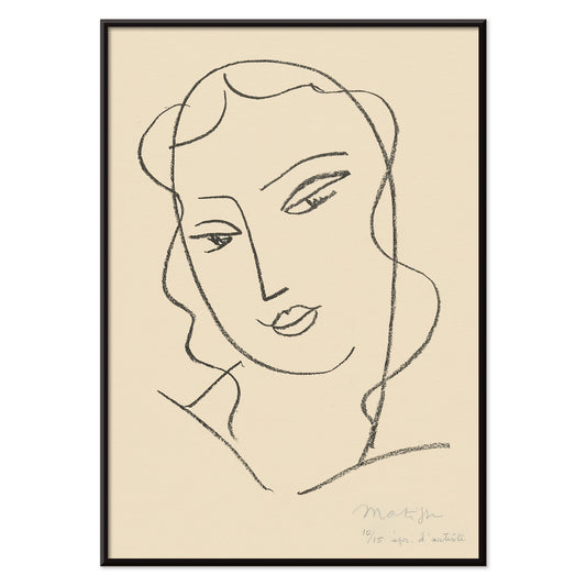
Tête voilée Poster
Henri Matisse · 1950 · tête voilée en impression d'art aux lignes noires souples et retenues
Poster dès €9 · Encadré dès €16
Prix habituel À partir de €6,00Prix habituel -
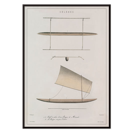
Pirogue de Célèbes Poster
J. Tastu · 1833 · impression scientifique d'une pirogue de Célèbes au fin tracé noir
Poster dès €9 · Encadré dès €16
Prix habituel À partir de €6,00Prix habituel -
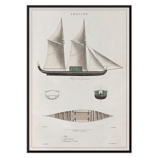
Amboine Poster
J. Tastu · 1833 · Amboine, étude de voilier au fond beige doux sur poster vertical
Poster dès €9 · Encadré dès €16
Prix habituel À partir de €6,00Prix habituel -
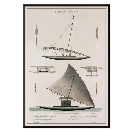
Tonga-Tabou Poster
J. Tastu · 1833 · impression scientifique précise autour des pirogues et de la navigation polynésienne
Poster dès €9 · Encadré dès €16
Prix habituel À partir de €6,00Prix habituel -
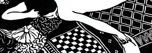
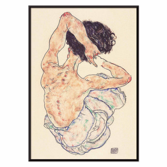
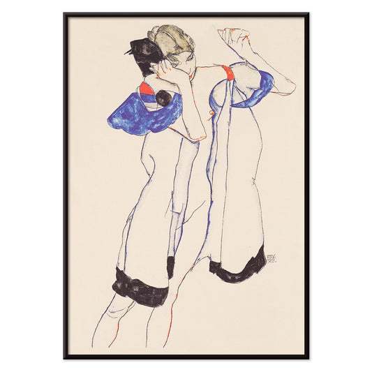
Nu assis vu de dos Poster
Egon Schiele · 1917 · poster vintage d'un nu assis, tracé en lignes de contour expressives
Poster dès €9 · Encadré dès €16
Prix habituel À partir de €6,00Prix habituel -
Femme en robe de chambre Poster
Egon Schiele · 1913 · impression d'art expressive d'une figure en robe, entre bleu, noir et beige
Poster dès €9 · Encadré dès €16
Prix habituel À partir de €6,00Prix habituel -
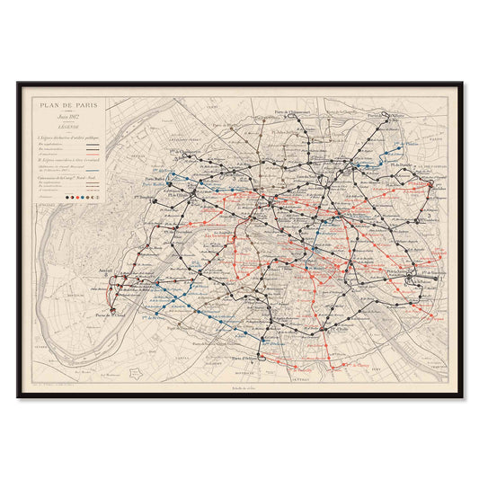
Plan de Paris métropolitain Poster
Louis Wuhrer · 1912 · poster du Métro parisien aux tracés précis sur un plan historique de la ville
Poster dès €9 · Encadré dès €16
Prix habituel À partir de €6,00Prix habituel -
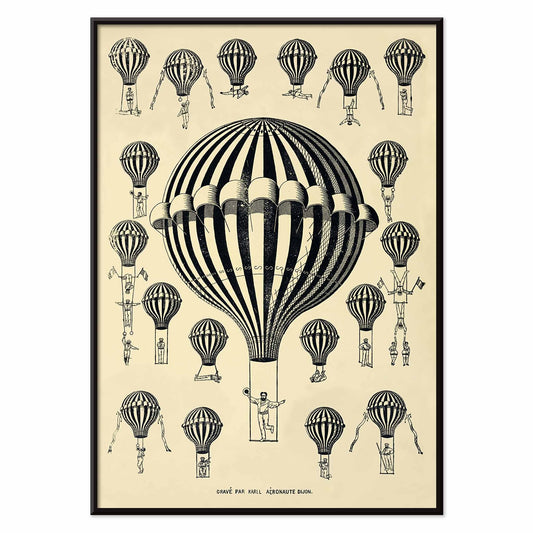
Étude de montgolfière Poster
Henry La Vaulx · 1876 · poster vintage d'esprit scientifique avec montgolfières rayées et dessin d'archive
Poster dès €9 · Encadré dès €16
Prix habituel À partir de €6,00Prix habituel -
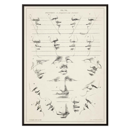
Clé de l'art de dessiner la figure humaine Poster
John Rubens Smith · 1831 · impression scientifique de figure humaine tracée avec un trait noir précis
Poster dès €9 · Encadré dès €16
Prix habituel À partir de €6,00Prix habituel


27/819 items
- No bestsellers in this collection
Le noir comme armature dans le design d'affiche vintage
Le noir se comporte souvent moins comme une couleur que comme une ossature. Dans le design d'affiche vintage, il aiguise les contours, stabilise l'ornementation et offre des respirations aux plages de couleur. Cette collection Noir rassemble des posters où l'obscurité se traduit par l'encre, la silhouette, le ciel nocturne ou l'épine typographique, plus un filtre éditorial qu'une règle monochrome. C'est un fil utile pour l'art mural et la décoration murale quand on souhaite une pièce composée sans tomber dans la raideur. Associez ces impressions à des matériaux qui portent déjà une note sombre, comme la ferronnerie, une base de lampe mate ou un textile charbon, et le reste de la palette paraîtra plus volontaire.
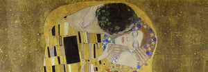
Comment les artistes ont utilisé le noir pour tenir l'image
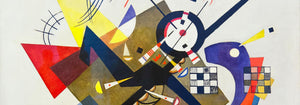
Dans The Kiss (1907–1908) de Gustav Klimt, le noir joue comme un velours derrière l'or, donnant l'impression d'une surface éclairée de l'intérieur et aidant l'ornement à rester lisible. La Tournée du Chat Noir (1896) de Théophile Alexandre Steinlen transforme un champ de minuit en théâtre, montrant comment la silhouette porte le caractère et l'humour sans quasiment de modelé. L'équilibre moderniste se révèle dans Circles in a Circle (1923) de Wassily Kandinsky, où des lignes noires servent d'échafaudage à la couleur et au mouvement. Même le panache publicitaire dépend de l'obscurité : Vermouth Martini (1920) de Leonetto Cappiello utilise l'ombre profonde pour faire ressortir le jaune citron et les tons de peau, astuce classique d'affiche pour une lisibilité immédiate.
Placer des posters à accents noirs dans la décoration
Parce que le noir se lit comme structure, ces choix de posters conviennent aux espaces qui gagnent en ordre visuel : halls, cuisines et coins de travail. Sur des murs pâles, les impressions à accent noir paraissent nettes et architecturales ; sur une peinture saturée, elles créent tension et profondeur. Dans une chambre, une bordure sombre peut apaiser une palette chargée, tandis que dans une salle à manger elle joue le rôle d'une veste taillée, offrant à la lumière des bougies et aux céramiques une scène plus claire. Pour des compagnons à fort contraste, voir Black & White ; pour des compositions retenues, Minimalist garde le rythme épuré. Si l'on préfère l'énergie des graphismes d'époque et de la signalétique, Advertising apporte lettrages audacieux et jeux de figure-fond dramatiques.
Composer associations, sujets et cadres
Sur un mur galerie mixte, laissez le noir être la note répétée : un poster graphique, un visuel figuratif, une estampe abstraite. Une planche naturaliste comme Tiger's Head (1911) d'Abbott Handerson Thayer apporte des empâtements denses et un pelage ombré qui s'accorde naturellement avec le laiton, le cuir et le bois foncé. Pour un espacement maîtrisé et une discipline typographique, mêlez de la géométrie depuis Bauhaus ; pour des sujets naturels, Animals conserve une imagerie cohérente tout en laissant revenir la ligne noire. Si vous cherchez un registre plus symbolique, Esoteric introduit bords tarot, étoiles et diagrammes qui résonnent avec la culture du trait scientifique. Le cadre importe : un frêne noirci ou un noyer fin peut faire écho à l'encre sans alourdir, tandis qu'un large passe-partout blanc apporte de l'air autour des contours délicats et des petits corps de texte.
Un accent sombre qui reste souple
Les détails noirs sont souvent ce qui persiste en mémoire : le profil d'un chat, une grille moderniste, le fin liseré autour d'une étiquette. Considérez cette collection comme un outil de décoration : choisissez un poster vintage pour ancrer une pièce et laissez la couleur, la texture et la lumière évoluer autour de lui. Quand le noir est utilisé comme une touche finale plutôt que comme une proclamation, les posters cessent d'être une simple nostalgie d'époque pour devenir des objets de design clairvoyant.