


- Détruisez cette brute folle Poster
- Le bon voisin de l'Amérique du Sud Poster
- Italie et Vatican Poster
- Les Lalanne Poster
- Couple dansant dans la neige Poster
- Clipper à réaction à destination d'Hawaii Poster
- Kohler Chocolat Poster
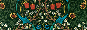
- Strawberry Thief Poster
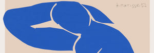
- Matisse Figures dansantes Poster
- Tom Krojer Poster d'exposition
- Scène de rue de Berlin Poster
- Exposition Ernst Kirchner Poster
- Femme assise de dos Poster
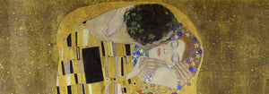
- Cheveux rouges, chapeau bleu Poster
- Parc près de Lu Poster
- El Comienzo Poster
- Parler Seul 2 Poster
- Twilight's Ring Poster
- Parler Seul Poster
- Le Rêve Poster
- Le Concert Poster
- Femme artiste Poster
- La revanche de Pink Panther Poster
- Femme et oiseau la nuit Poster
- Visitez Puerto Rico Poster
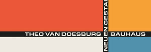
- Bauhaus 20 Poster
- Bauhaus 21 Poster
- Mangez plus de fruits Poster
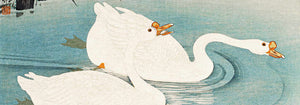
- Grue japonaise bleue Poster
- Snoopy Come Home Poster
- Vers Londres en Jet Clipper Poster
- Crans-sur-Sierre Poster
- Monte Carlo Poster
- Pacific Vibrations Poster
- Continental Hawaï Airline Surfeur Poster
- Bière et Cigarette Poster
- Côte ouest du Mexique Poster
-
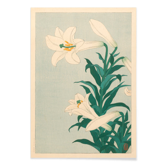
Fleurs de lys Poster
Ohara Koson · 1927 · Impression botanique sereine de lys blancs sur fond bleu apaisant
Poster dès €9 · Encadré dès €16
Prix habituel À partir de €6,00Prix habituel -
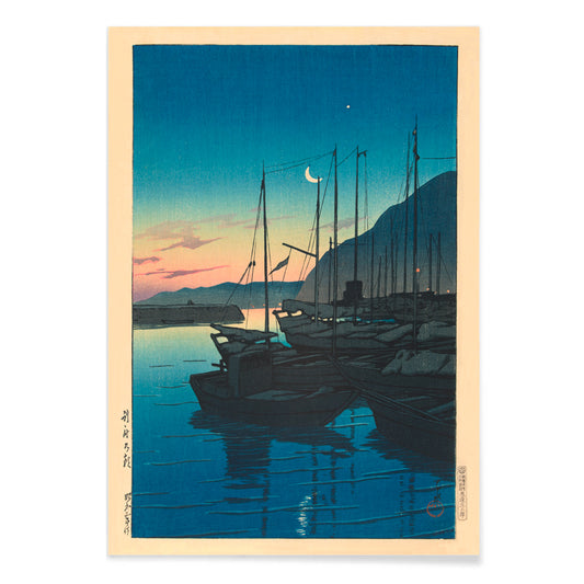
Matin à Beppu Poster
Kawase Hasui · 1937 · Sérénité portuaire au lever du soleil, impression d'art avec bateaux, brume et reflets lumineux
Poster dès €9 · Encadré dès €16
Prix habituel À partir de €6,00Prix habituel -
Nénuphar fleuri Poster
Ohara Koson · 1910 · Impression botanique vintage sereine de nénuphars roses flottant parmi larges feuilles
Poster dès €9 · Encadré dès €16
Prix habituel À partir de €6,00Prix habituel -
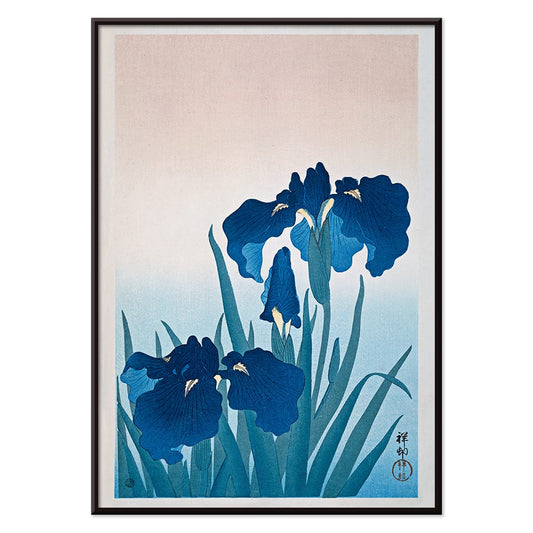
Iris Poster
Ohara Koson · 1925 · Paisible impression botanique d'iris bleus aux feuilles élancées et composition japonaise aérienne
Poster dès €9 · Encadré dès €16
Prix habituel À partir de €6,00Prix habituel -
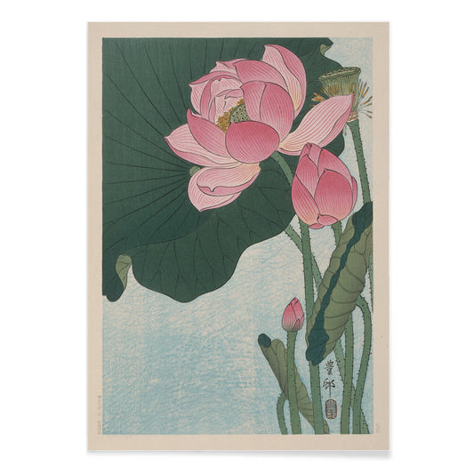
Lotus en fleurs Poster
Ohara Koson · 1923 · Impression d'art apaisante de lotus en fleurs aux pétales roses et tons bleus calmes
Poster dès €9 · Encadré dès €16
Prix habituel À partir de €6,00Prix habituel -
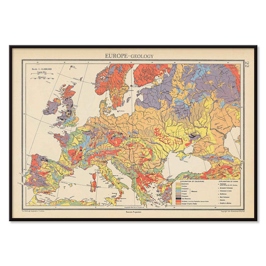
Carte géologique de l'Europe Poster
John George Bartholomew · 1942 · poster détaillé de la géologie européenne aux couleurs superposées et au trait cartographique fin
Poster dès €9 · Encadré dès €16
Prix habituel À partir de €6,00Prix habituel -
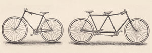
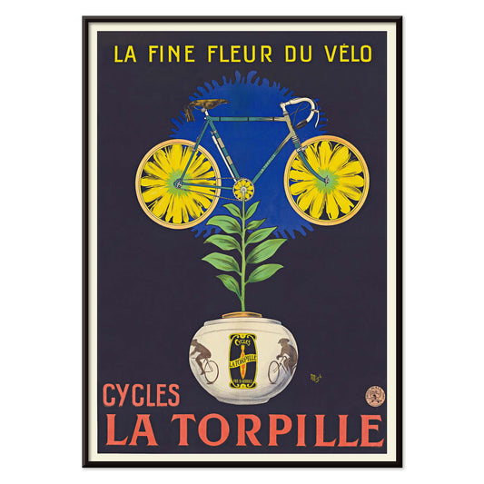
Cycles La Torpille Poster
Mich · 1923 · affiche cycliste fleurie aux couleurs Art Deco franches
Poster dès €9 · Encadré dès €16
Prix habituel À partir de €6,00Prix habituel -
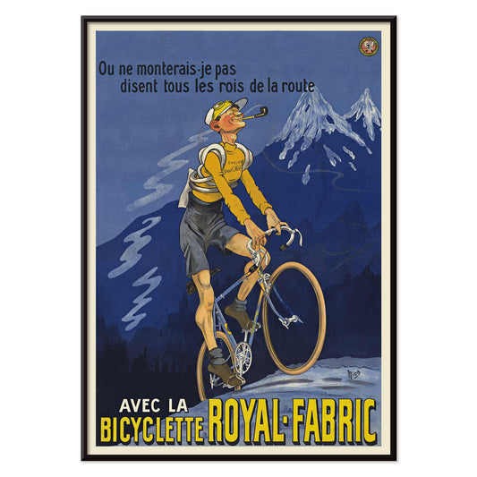
Bicyclette Royal-Fabric Poster
Michel Liebeaux · 1922 · poster vintage de bicyclette avec cycliste en montée et lettrage Royal-Fabric
Poster dès €9 · Encadré dès €16
Prix habituel À partir de €6,00Prix habituel -
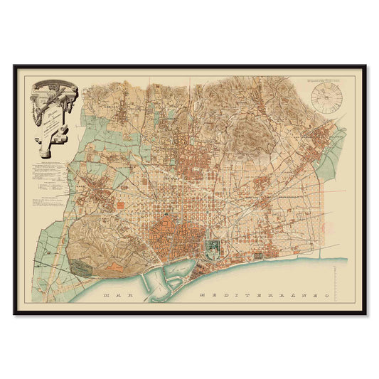
Plan de Barcelone et de ses environs Poster
Artiste inconnu · 1890 · poster de carte de Barcelona aux rues sépia et détails côtiers
Poster dès €9 · Encadré dès €16
Prix habituel À partir de €6,00Prix habituel -
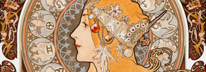
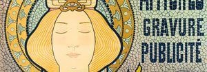
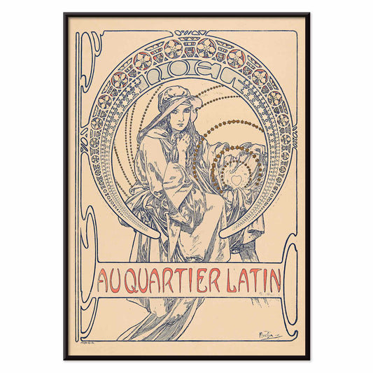
Au Quartier Latin Poster
Alphonse Mucha · 1900 · poster Art Nouveau à figure assise dans un médaillon ornemental
Poster dès €9 · Encadré dès €16
Prix habituel À partir de €6,00Prix habituel -
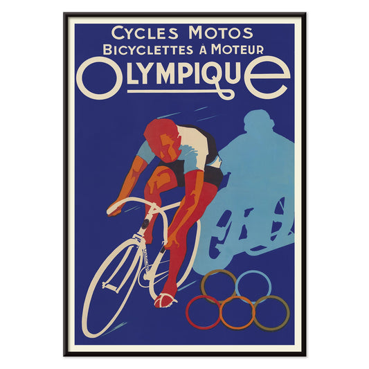
Cycles Olympique Poster
Affiches Gaillard · 1931 · poster vintage avec cycliste lancé en course et anneaux olympiques
Poster dès €9 · Encadré dès €16
Prix habituel À partir de €6,00Prix habituel -
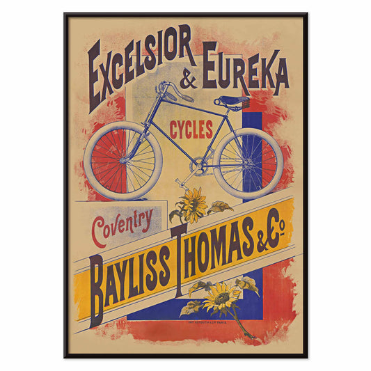
Cycles Excelsior et Eureka Poster
Bayliss Thomas & Co · 1895 · poster vintage au vélo bleu et au lettrage victorien affirmé
Poster dès €9 · Encadré dès €16
Prix habituel À partir de €6,00Prix habituel -
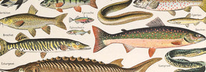
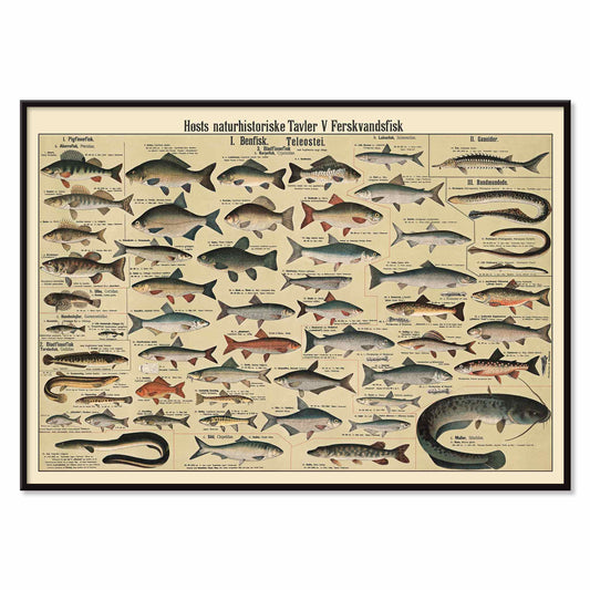
Planche de poissons d'eau douce Poster
Dr. W. Raschke · 1935 · une planche de poissons d'eau douce aux études scientifiques précises et détaillées
Poster dès €9 · Encadré dès €16
Prix habituel À partir de €6,00Prix habituel -
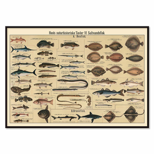
Planche de poissons d'eau salée Poster
Dr. W. Raschke · 1909 · impression scientifique détaillée de poissons d'eau salée sur fond beige chaleureux
Poster dès €9 · Encadré dès €16
Prix habituel À partir de €6,00Prix habituel -
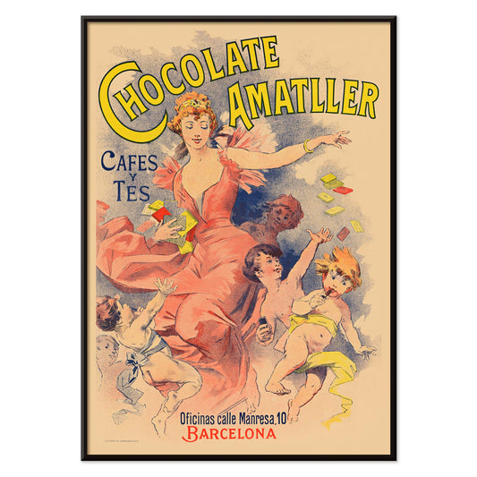
Chocolate Amatller Poster
Artiste inconnu · 1893 · poster vintage Chocolate Amatller à l'énergie joyeuse de la publicité barcelonaise
Poster dès €9 · Encadré dès €16
Prix habituel À partir de €6,00Prix habituel -
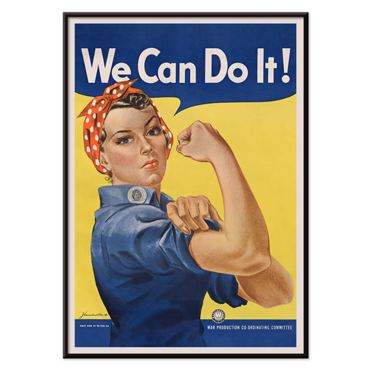
We Can Do It! Poster
J. Howard Miller · 1942 · poster percutant avec Rosie la riveteuse et un slogan de guerre affirmé
Poster dès €9 · Encadré dès €16
Prix habituel À partir de €6,00Prix habituel -
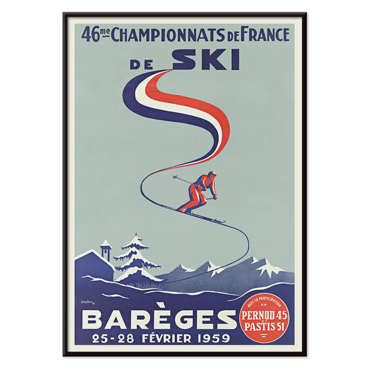
46e Championnats de France de ski Poster
H. Mathieu · 1959 · poster vintage des Championnats de France de ski à Barèges, motif de skieur élancé
Poster dès €9 · Encadré dès €16
Prix habituel À partir de €6,00Prix habituel -
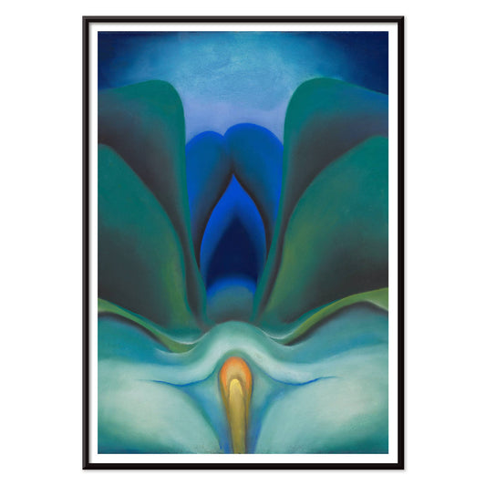
Fleur bleue Poster
Georgia O'Keeffe · 1919 · impression botanique aux pétales bleus lumineux et au centre doucement éclatant
Poster dès €9 · Encadré dès €16
Prix habituel À partir de €6,00Prix habituel -
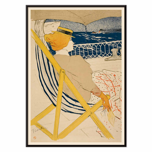
La passagère du 54 Poster
Henri de Toulouse-Lautrec · 1895 · poster vintage montrant une passagère en chaise longue jaune au-dessus de l'eau bleue
Poster dès €9 · Encadré dès €16
Prix habituel À partir de €6,00Prix habituel -
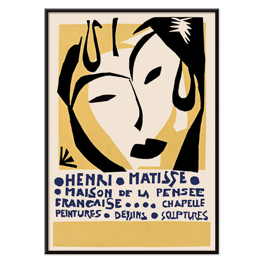
Maison de la Pensée française Poster
Henri Matisse · 1950 · poster d'exposition au visage de masque et à la typographie bleue
Poster dès €9 · Encadré dès €16
Prix habituel À partir de €6,00Prix habituel -
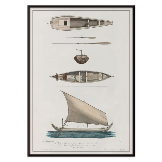
Bateaux chinois et javanais Poster
J. Tastu · 1833 · impression scientifique de bateaux chinois et javanais en gris et bleu doux
Poster dès €9 · Encadré dès €16
Prix habituel À partir de €6,00Prix habituel -
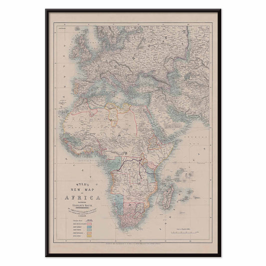
Nouvelle carte de l'Afrique Poster
Wyld · 1887 · carte vintage en poster aux tons assourdis et aux côtes africaines détaillées
Poster dès €9 · Encadré dès €16
Prix habituel À partir de €6,00Prix habituel


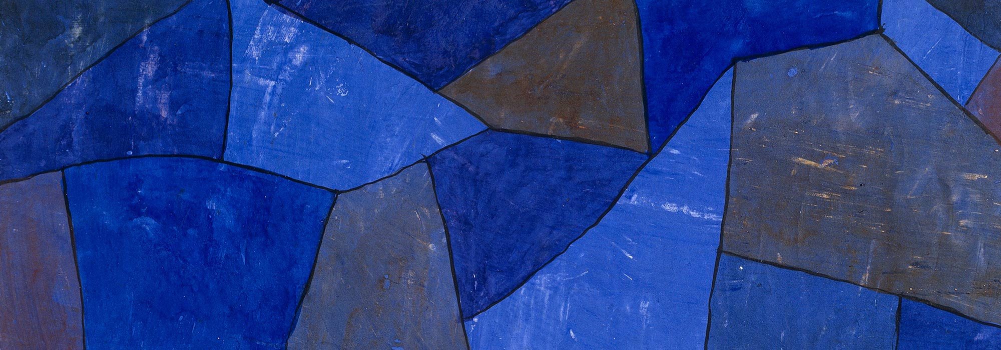
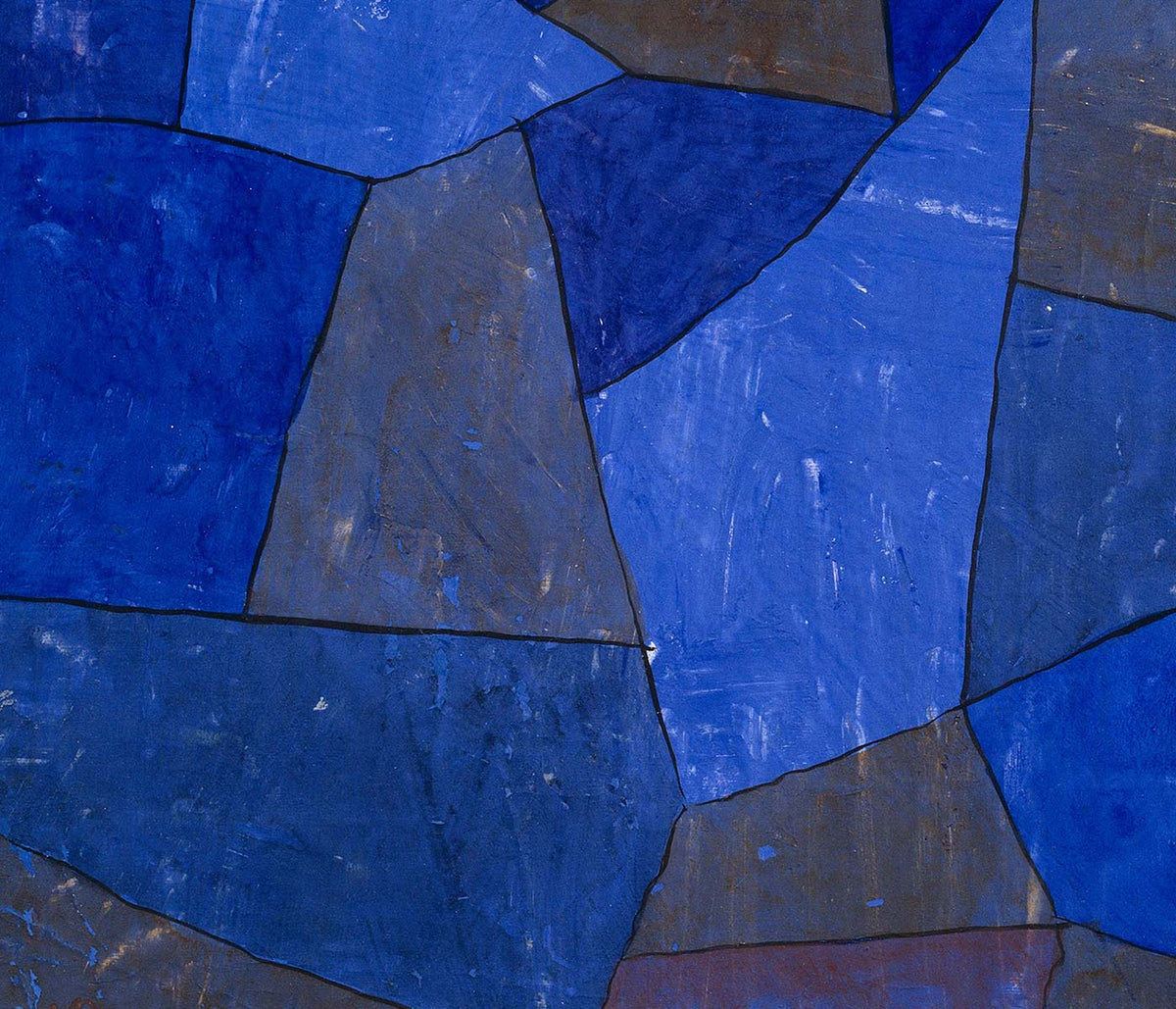
Le bleu comme atmosphère, pas seulement une couleur
Le bleu ne se limite pas à une teinte : dans nos posters vintage il devient une donnée d’espace, un indice de profondeur et parfois une temporalité. Entre l’encre sombre et le lavis atténué, il peut suggérer la distance, la météo ou la densité d’un objet imprimé. La collection confronte usages et techniques pour montrer comment le bleu structure une composition et influence l’art mural.
Techniques et nuances : indigo, cyanotype et impression
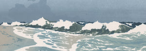
Le bleu arrive par des voies différentes : teinture textile, procédés photographiques, encres lithographiques. L’indigo créé des fonds riches et répétés, le cyanotype emprunte au soleil une tonalité de planche tandis que les encres d’imprimerie livrent des bleus texturés et granuleux. On retrouve ces variations dans des pièces comme Strawberry Thief de William Morris ou des planches botaniques historiques qui transforment la couleur en langage visuel entre motif et spécimen.
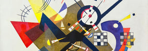
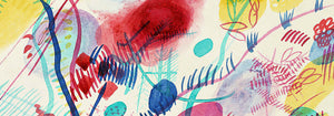
Le bleu en abstraction et en composition graphique
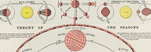
En abstraction, le bleu fonctionne comme scène et support de signes ; il relie formes, musique et science dans des compositions où la couleur crée rythme et suspension. Les estampes et gravures où le champ bleu occupe la place centrale offrent un équilibre entre lisibilité et émotion, permettant aux œuvres de dialoguer avec le regard et l’architecture de la pièce.
Associer le bleu au reste de la maison
En décoration, le bleu gagne à être ancré par des matériaux : le bois clair tempère un bleu profond, le lin adoucit une estampe, le métal valorise un bleu acier. Une impression bleue dans une entrée devient repère visuel ; dans une chambre, elle favorise la quiétude. Pour conserver l’équilibre, associez une pièce dominante à des compagnes plus neutres ou texturées, ou introduisez une cartographie ou une composition botanique comme contrepoint.
Rythme, échelle et encadrement
La scénographie du bleu repose sur le rythme et l’échelle : commencez par une œuvre principale, ajoutez une ou deux pièces plus discrètes qui reprennent la même température chromatique sans reproduire le motif. Les choix d’encadrement modulent l’effet : un chêne clair garde la légèreté, un passe-partout blanc apporte de la respiration, un cadre noir fin intensifie le contraste. Des options sont disponibles dans Frames.
Le bleu comme signe
Ce qui unit ces posters n’est pas une période déterminée mais la manière dont le bleu porte de l’information : teinture, pigment, encre ou notation scientifique. Il cohabite naturellement avec livres, céramiques et objets de voyage, et évoque autant la mer que la bibliothèque. C’est cette tension entre sensation et structure qui fait du bleu un choix durable et adaptable pour l’art mural vintage.