


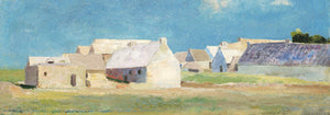


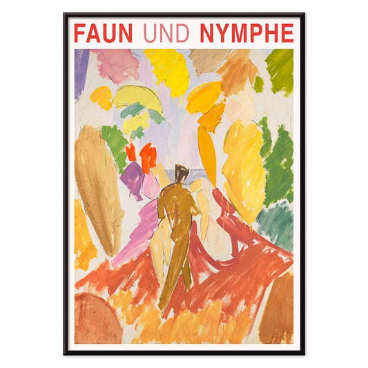
- Faun and Nymphe Poster
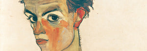
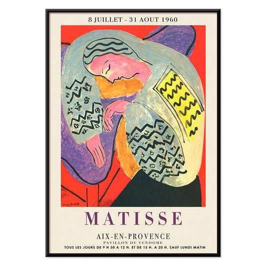
- The Dream Poster
- Visit Puerto Rico Poster
- Butter Poster
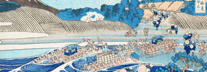
- Ecchu Umidani Pass Poster
- The green tree library Poster
- Atlas of the Munsell color system Poster
- Adelaster Albivenis Poster
- Flower Market - Mumbai Poster
- Flower Market - Kyoto Poster
- Flower Market - Dehli Poster
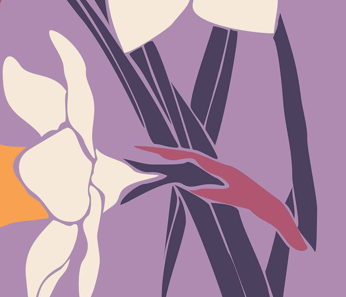
- Flower Market - Cape Town Poster
- Flower Market - Cardiff Poster
- Flower Market - Seoul 2 Poster
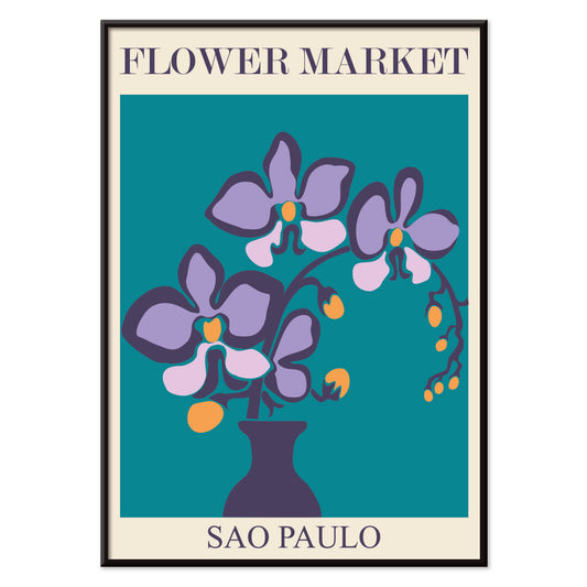
- Flower Market - Sao Paulo Poster
- Flower Market - Rome Poster
- Flower Market - Milano Poster
- Flower Market - Berlin Poster
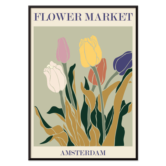
- Flower Market - Amsterdam Poster
- Flower Market Columbia Road Poster
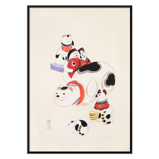
- Japanese Toys 2 Poster
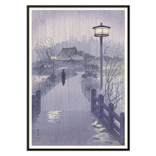
- Shinobazu pond Poster
- The Theory and Practice of Color Poster
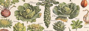
- Green Vegetables and herbs Poster
- Métamorphose du violon Poster
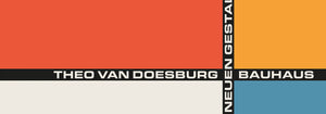
- Bauhaus Poster 11 Poster
- Bauhaus Poster 10 Poster
- Faust , tragédie de Goethe Poster
- Farbstudien, 10 Blätter IX Poster
- Farbstudien, 10 Blätter VIII Poster
- Randy Brecker Quintet Poster
- Nothing like a good book Poster
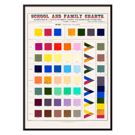
- Familiar colors Poster
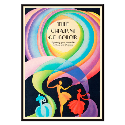
- The Charm of Color Poster
-
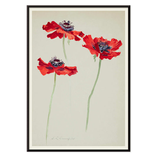
Three Studies of Poppies Poster
Sophia Crownfield · 1900 · Delicate botanical print presenting three poppy studies with vivid petals and slender stems
Poster from €9 · Framed from €16
Regular price From €6,00Regular price -
Faun and Nymphe Poster
Edvard Weie · 1941 · Expressive mythic poster pairing a faun and nymph in bold modernist color blocks
Poster from €9 · Framed from €16
Regular price From €6,00Regular price -
The Dream Poster
Henri Matisse · 1960 · Vibrant sleeping figure poster with flowing contours and bold, flat color shapes
Poster from €9 · Framed from €16
Regular price From €6,00Regular price -
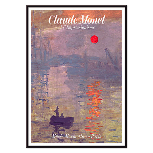
Soleil Levant Poster
Claude Monet · 1872 · Misty harbor sunrise poster with orange sun and blue-grey water reflections
Poster from €9 · Framed from €16
Regular price From €6,00Regular price -
Max Bill Poster
Max Bill · 1974 · Geometric abstract poster with interlocking forms in vivid red, orange, green, and purple
Poster from €9 · Framed from €16
Regular price From €6,00Regular price -
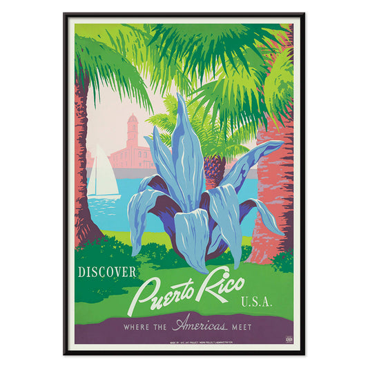
Visit Puerto Rico Poster
Unknown artist · 1950 · Mid-century Puerto Rico travel poster featuring a sailboat and historic coastal fort
Poster from €9 · Framed from €16
Regular price From €6,00Regular price -
Butter Poster
Donald Brun · 1951 · Playful butter poster with smooth airbrushed shading and bold mid-century Swiss clarity
Poster from €9 · Framed from €16
Regular price From €6,00Regular price -
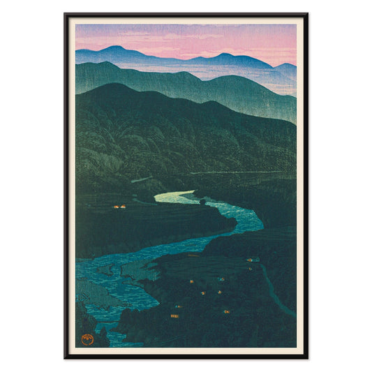
Ecchu Umidani Pass Poster
Kawase Hasui · 1923 · Serene mountain-pass art print with layered blue ridges and a winding path
Poster from €9 · Framed from €16
Regular price From €6,00Regular price -
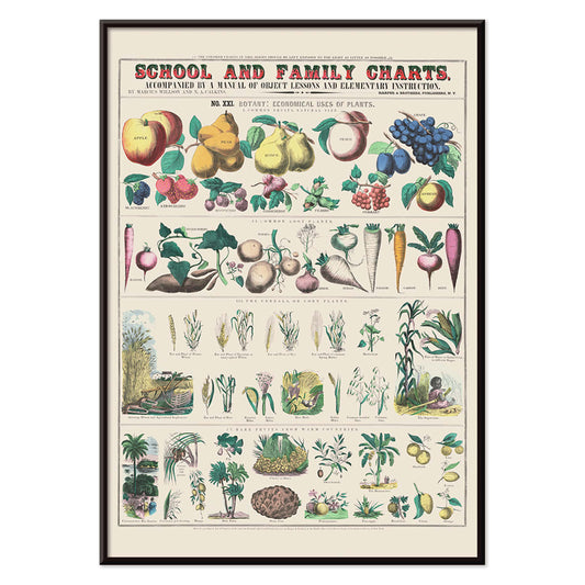
Economical use of plants Poster
Marcius Willson · 1865 · Detailed botanical chart poster mapping practical plant uses in crisp labeled vignettes
Poster from €9 · Framed from €16
Regular price From €6,00Regular price -
Nihon chikurui zufu Pl.11 Poster
Yasuyoshi Shirasawa · 1912 · Japanese bamboo botanical print with slender stalks and airy leaves on cream
Poster from €9 · Framed from €16
Regular price From €6,00Regular price -
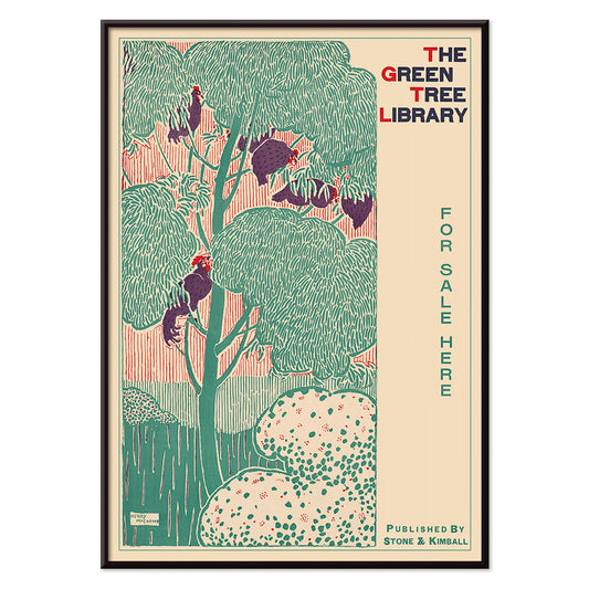
The green tree library Poster
Henry McCarter · 1890 · Decorative library poster featuring a stylized green tree and bold Art Nouveau lettering
Poster from €9 · Framed from €16
Regular price From €6,00Regular price -
Yachigusa Pl.24 Poster
Seikō Ueno · 1902 · Stylized red sail and purple blossoms vintage print with calm, airy Japanese elegance
Poster from €9 · Framed from €16
Regular price From €6,00Regular price -
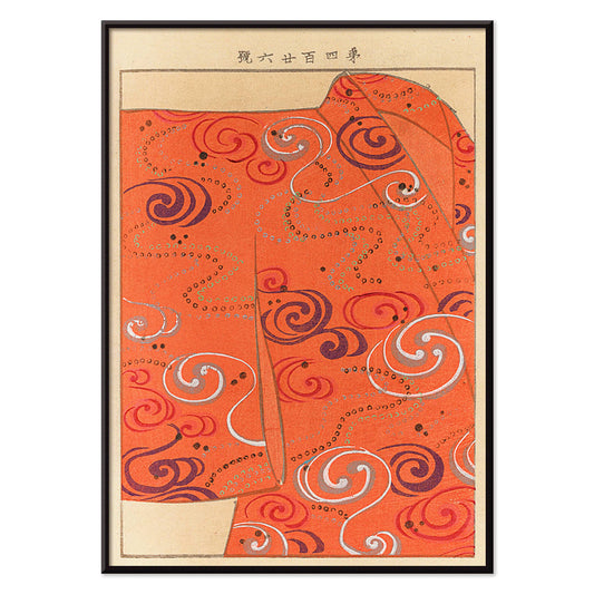
Yachigusa Pl.06 Poster
Seikō Ueno · 1902 · Swirling orange kimono pattern vintage print with rhythmic curves and crisp negative space
Poster from €9 · Framed from €16
Regular price From €6,00Regular price -
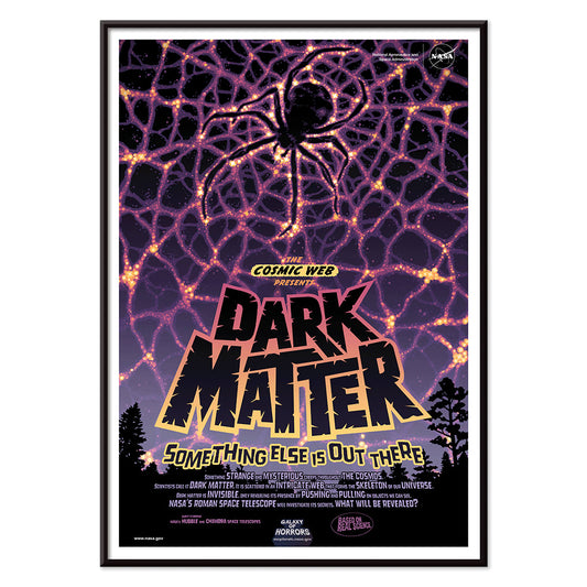
Dark Matter Poster
NASA · 2016 · Cosmic spider web poster blending neon filaments with deep space darkness
Poster from €9 · Framed from €16
Regular price From €6,00Regular price -
Flares of Fury Poster
NASA · 2012 · Explosive solar-flare poster with fiery arcs around a glowing star in deep space
Poster from €9 · Framed from €16
Regular price From €6,00Regular price -
Atlas of the Munsell color system Poster
Albert Henry Munsell · 1915 · Iconic color system poster mapping hues, value, and chroma in a tidy chart
Poster from €9 · Framed from €16
Regular price From €6,00Regular price -
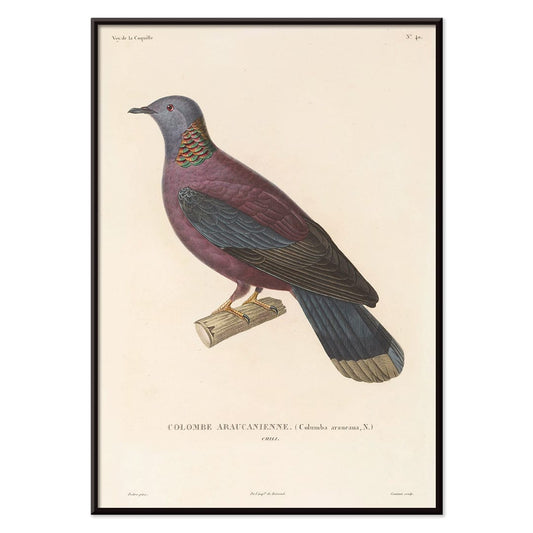
Voyage autour du monde 148 Poster
Louis-Isidore Duperrey · 1825 · Natural history bird print with poised profile and delicate hand-tinted detailing
Poster from €9 · Framed from €16
Regular price From €6,00Regular price -
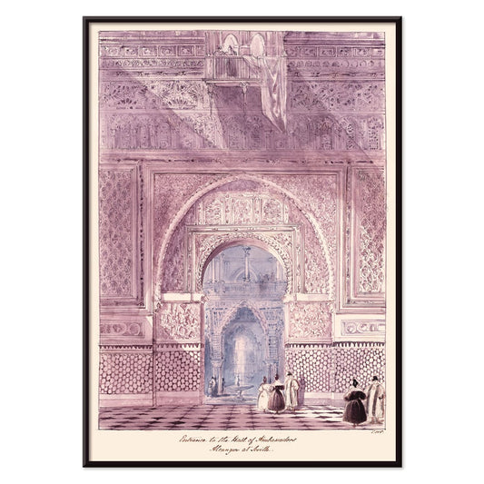
Hall of Ambassadors Poster
Charles Hamilton Smith · 1835 · Detailed architectural art print of the Alcazar hall with rhythmic Moorish arches
Poster from €9 · Framed from €16
Regular price From €6,00Regular price -
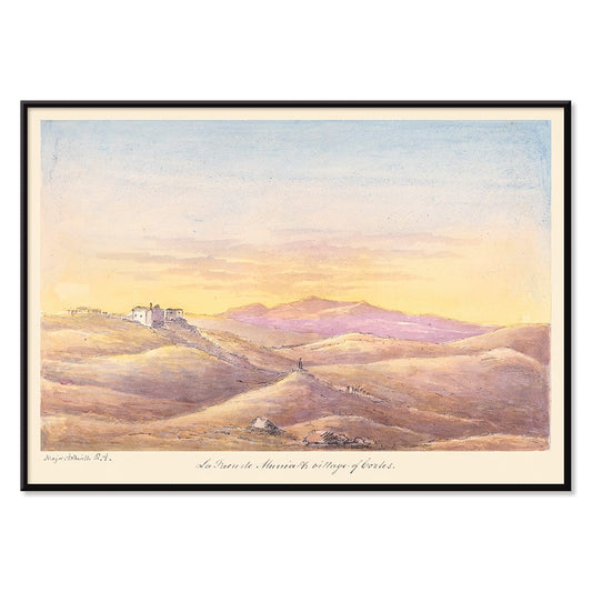
La Fuen de Munia Poster
Charles Hamilton Smith · 1835 · Serene sunset village poster with rolling hills and softly fading Mediterranean sky
Poster from €9 · Framed from €16
Regular price From €6,00Regular price -
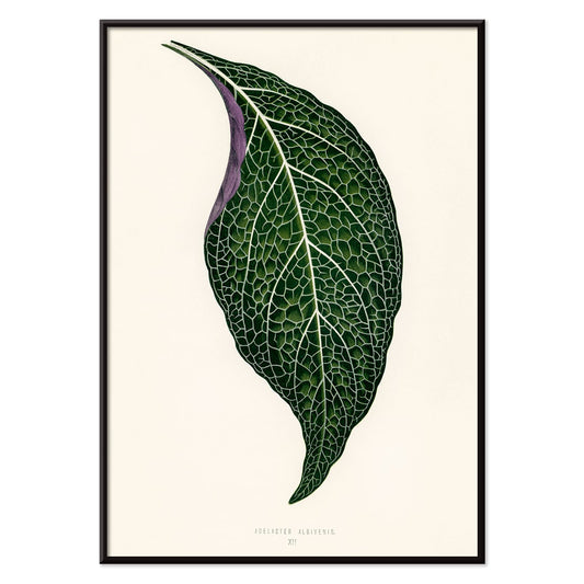
Adelaster Albivenis Poster
Shirley Hibberd · 1855 · Elegant botanical print of a single green leaf with purple veins on white
Poster from €9 · Framed from €16
Regular price From €6,00Regular price -
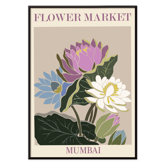
Flower Market - Mumbai Poster
MORYARTY · 2022 · Vibrant water lily poster evoking Mumbai flower market blooms in purple, green, and blue
Poster from €9 · Framed from €16
Regular price From €6,00Regular price -
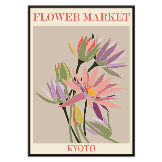
Flower Market - Kyoto Poster
MORYARTY · 2021 · Vibrant Kyoto flower market poster with stylized blossoms and clean graphic lines
Poster from €9 · Framed from €16
Regular price From €6,00Regular price -
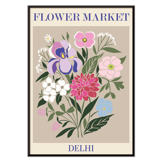
Flower Market - Dehli Poster
MORYARTY · 2023 · Vibrant Delhi flower market poster with layered blooms and a lively graphic mood
Poster from €9 · Framed from €16
Regular price From €6,00Regular price -
Flower Market - Cape Town Poster
MORYARTY · 2013 · Vibrant bird of paradise poster in abstract shapes bringing tropical energy and bold color
Poster from €9 · Framed from €16
Regular price From €6,00Regular price -
Flower Market - Cardiff Poster
MORYARTY · 2010 · Graphic daffodils poster set against deep purple for a bright seasonal statement
Poster from €9 · Framed from €16
Regular price From €6,00Regular price -
Flower Market - Seoul 2 Poster
MORYARTY · 2021 · Energetic floral market poster with bold orange field and graphic blooms in pink and purple
Poster from €9 · Framed from €16
Regular price From €6,00Regular price -
Flower Market - Sao Paulo Poster
MORYARTY · 2017 · Vibrant orchid poster with a clean vase form on deep teal
Poster from €9 · Framed from €16
Regular price From €6,00Regular price -
Flower Market - Rome Poster
MORYARTY · 2019 · Vibrant lily bouquet poster inspired by Roman flower markets in warm pink and orange tones
Poster from €9 · Framed from €16
Regular price From €6,00Regular price -
Flower Market - Milano Poster
MORYARTY · 2022 · Colorful floral bouquet poster capturing the lively spirit of a Milan flower market
Poster from €9 · Framed from €16
Regular price From €6,00Regular price -
Flower Market - Berlin Poster
MORYARTY · 2019 · Colorful flower bouquet poster with bold Berlin lettering and lively market energy
Poster from €9 · Framed from €16
Regular price From €6,00Regular price -
Flower Market - Amsterdam Poster
MORYARTY · 2019 · Retro tulip market poster capturing Amsterdam energy with earthy tones and graphic simplicity
Poster from €9 · Framed from €16
Regular price From €6,00Regular price -
Flower Market Columbia Road Poster
MORYARTY · 2017 · Vibrant floral poster featuring a stylized vase and bouquet in bold modern colors
Poster from €9 · Framed from €16
Regular price From €6,00Regular price -
Clear Plate Poster
James Fitton · 1950 · Mid-century food poster with bold plate design and a message about avoiding waste
Poster from €9 · Framed from €16
Regular price From €6,00Regular price -
Japanese Toys 2 Poster
Kawasaki Kyosen · 1919 · Playful toy cat poster with crisp outlines and festive red, yellow, and purple accents
Poster from €9 · Framed from €16
Regular price From €6,00Regular price -
Brazil 1 Poster
Waldomiro Goncalves Christino · 1984 · Sunlit Rio travel poster featuring Sugarloaf Mountain in bold modern color blocks
Poster from €9 · Framed from €16
Regular price From €6,00Regular price -
Shinobazu pond Poster
Kasamatsu Shirô · 1938 · Rainy evening art print of Shinobazu Pond with a solitary walker and reflections
Poster from €9 · Framed from €16
Regular price From €6,00Regular price -
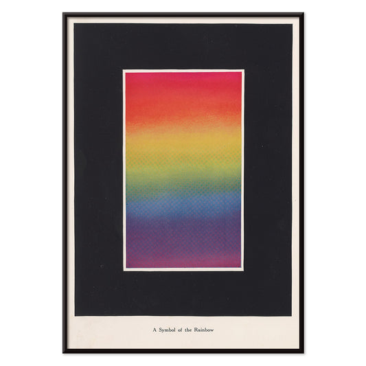
The Theory and Practice of Color Poster
Bonnie E. Snow · 1918 · Radiant rainbow diagram poster blending smooth gradients with crisp educational typography
Poster from €9 · Framed from €16
Regular price From €6,00Regular price -
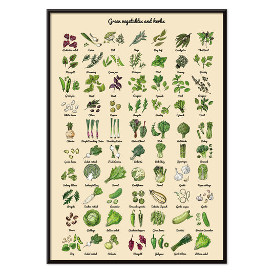
Green Vegetables and herbs Poster
MORYARTY · 2012 · Fresh vegetable and herb print laid out as a clean contemporary botanical study
Poster from €9 · Framed from €16
Regular price From €6,00Regular price -
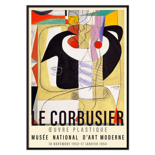
Métamorphose du violon Poster
Le Corbusier · 1920 · Modernist violin poster turning instrument curves into crisp geometric rhythms in primary tones
Poster from €9 · Framed from €16
Regular price From €6,00Regular price -
Bauhaus Poster 11 Poster
MORYARTY · Contemporary · Geometric poster with bold circles and diagonals in primary colors on white
Poster from €9 · Framed from €16
Regular price From €6,00Regular price -
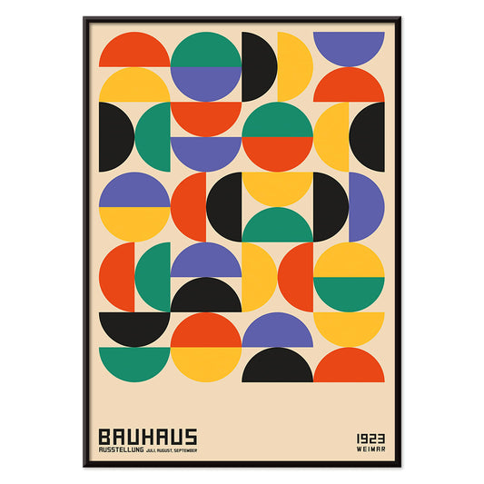
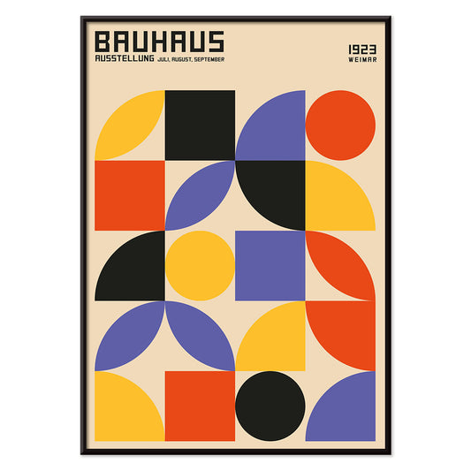
Bauhaus Poster 10 Poster
MORYARTY · 1923 · Geometric Bauhaus poster balancing circles and bars in bold primary color accents
Poster from €9 · Framed from €16
Regular price From €6,00Regular price -
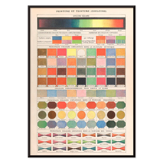
Peinture et Teinture Poster
Claude Augé · 1908 · Educational color chart poster pairing French labels with orderly pigment swatches
Poster from €9 · Framed from €16
Regular price From €6,00Regular price -
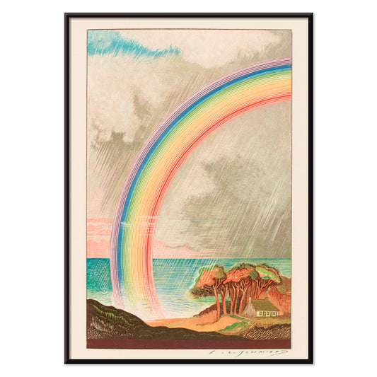
Faust , tragédie de Goethe Poster
F. L. Schmied · 1925 · Dreamlike Faust poster with a radiant rainbow over calm sea and coast
Poster from €9 · Framed from €16
Regular price From €6,00Regular price -
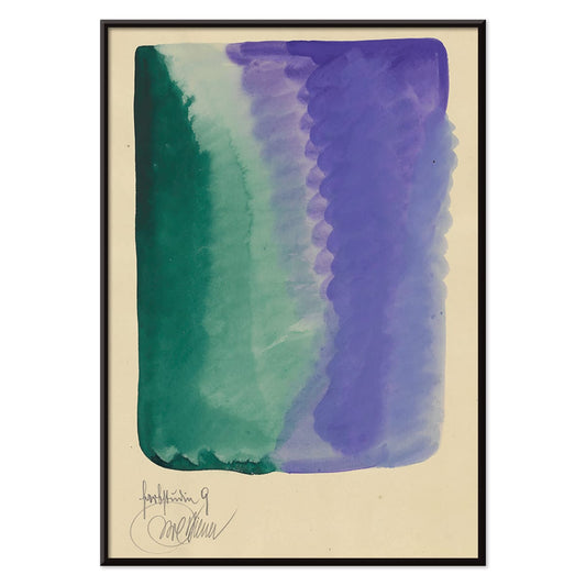
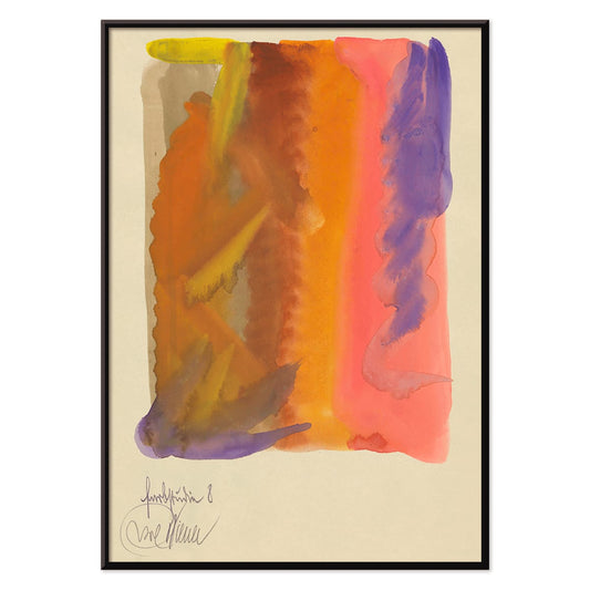
Farbstudien, 10 Blätter IX Poster
Karl Wiener · 1923 · Abstract watercolor art print balancing green and violet washes with quiet modernist rhythm
Poster from €9 · Framed from €16
Regular price From €6,00Regular price -
Farbstudien, 10 Blätter VIII Poster
Karl Wiener · 1923 · Fluid abstract art print with warm yellow washes and deep purple currents
Poster from €9 · Framed from €16
Regular price From €6,00Regular price -
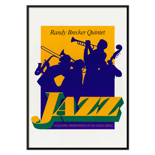
Randy Brecker Quintet Poster
U.S. Information Agency · 1987 · Graphic jazz poster featuring silhouetted musicians on a bold purple background with green accents
Poster from €9 · Framed from €16
Regular price From €6,00Regular price -
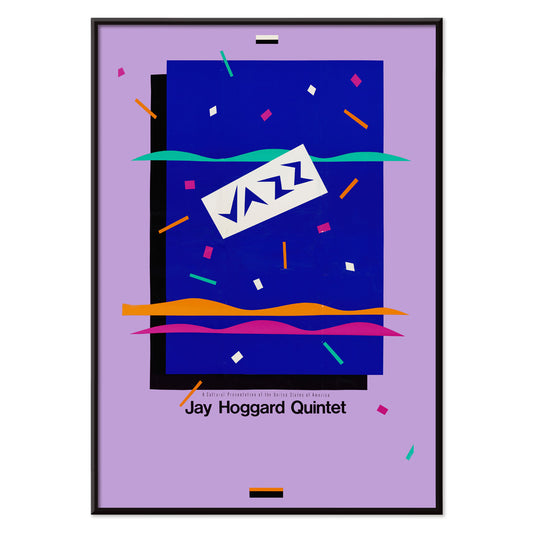
Jay Hoggard Quintet Poster
U.S. Information Agency · 1985 · Energetic abstract jazz poster with geometric rhythms echoing vibraphone improvisations
Poster from €9 · Framed from €16
Regular price From €6,00Regular price -
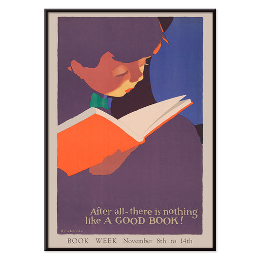
Nothing like a good book Poster
Jon O Brubaker · 1925 · Cheerful girl reading poster with bold 1920s shapes in purple and red
Poster from €9 · Framed from €16
Regular price From €6,00Regular price -
Familiar colors Poster
Marcius Willson · 1890 · Educational color chart poster featuring geometric squares and triangles in vivid primary colors
Poster from €9 · Framed from €16
Regular price From €6,00Regular price -
The Charm of Color Poster
Marie Josephine Carr · 1928 · Joyful Art Deco dance poster with swirling figures and rainbow costume accents
Poster from €9 · Framed from €16
Regular price From €6,00Regular price -
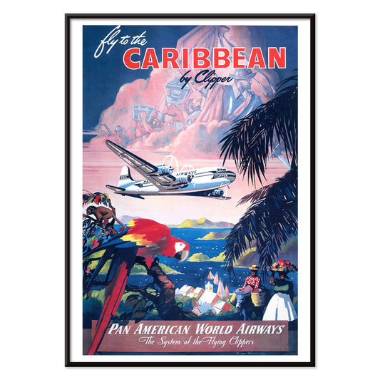
Fly to the Caribbean Poster
Mark Von Arenburg · 1949 · Sunlit Caribbean travel poster with a Clipper flying over palms and sailboats
Poster from €9 · Framed from €16
Regular price From €6,00Regular price -
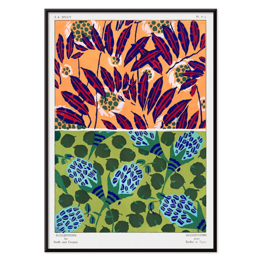
Vintage floral patterns Poster
E. A. Séguy · 1925 · Art Deco floral pattern poster with jewel-toned motifs arranged in a neat grid
Poster from €9 · Framed from €16
Regular price From €6,00Regular price -
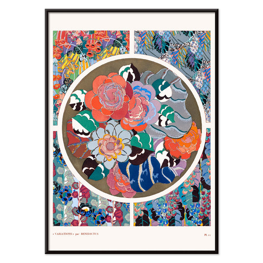
Flower art deco pattern 11 Poster
Édouard Bénédictus · 1928 · Vibrant Art Deco floral vintage print with geometric petals and rhythmic symmetry
Poster from €9 · Framed from €16
Regular price From €6,00Regular price -
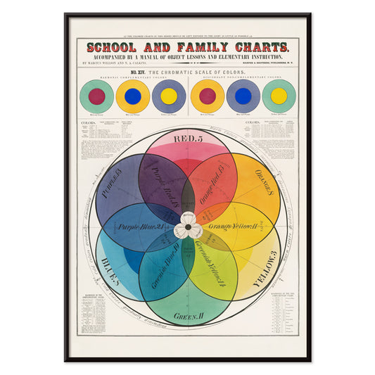
The Chromatic scale of colors Poster
Marcius Willson · 1890 · Meticulously labeled chromatic color wheel poster with crisp geometry and vivid spectrum
Poster from €9 · Framed from €16
Regular price From €6,00Regular price -
Iriartea Ventricosa Poster
Carl Friedrich Philipp von Martius · 1823 · Elegant palm botanical print with airy fronds and scientific detail
Poster from €9 · Framed from €16
Regular price From €6,00Regular price -
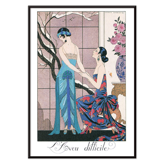
L’aveu Difficile Poster
George Barbier · 1924 · Art Deco fashion poster featuring poised figures and theatrical elegance in jewel tones
Poster from €9 · Framed from €16
Regular price From €6,00Regular price -
L’Eau Poster
George Barbier · 1924 · Elegant Art Deco poster of waterside leisure in vivid blue with pink accents
Poster from €9 · Framed from €16
Regular price From €6,00Regular price -
La Terre Poster
George Barbier · 1924 · Elegant Art Deco poster of women and child harvesting fruit in a stylized garden
Poster from €9 · Framed from €16
Regular price From €6,00Regular price -
Composition Poster
Robert Delaunay · 1930 · Radiant abstract art print of interlocking circles and angled color planes in motion
Poster from €9 · Framed from €16
Regular price From €6,00Regular price -
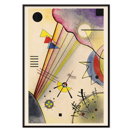
Delicate Soul Poster
Wassily Kandinsky · 1925 · Geometric abstract art print with crisp black lines, yellow highlights, and soft purple forms
Poster from €9 · Framed from €16
Regular price From €6,00Regular price -
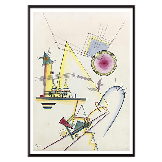
Deutliche Verbindung Poster
Wassily Kandinsky · 1925 · Geometric abstract art print balancing circles and angles in energetic primary and violet accents
Poster from €9 · Framed from €16
Regular price From €6,00Regular price -
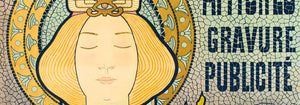
A woman holds flowers Poster
Louis Rhead · 1890 · Art Nouveau perfume poster featuring a graceful woman with flowers in yellow and purple
Poster from €9 · Framed from €16
Regular price From €6,00Regular price -
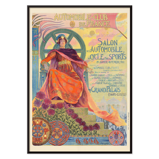
Automobile Club De France Poster
Georges Antoine Rochegrosse · 1901 · Elegant Art Nouveau poster featuring an allegorical muse with flowers and automotive gears
Poster from €9 · Framed from €16
Regular price From €6,00Regular price -
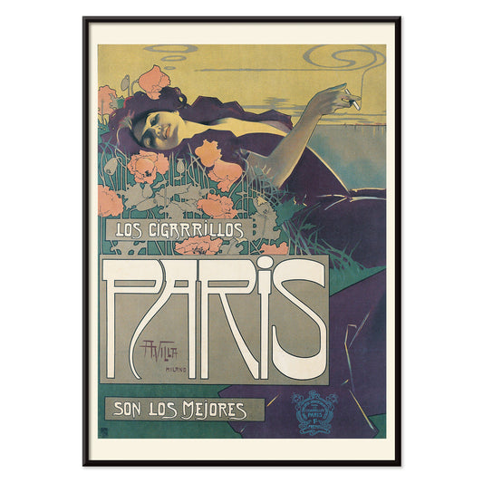
Cigarrillos Paris Poster
Aleardo Villa · 1901 · Elegant Belle Époque poster featuring a reclining woman amid pink and purple flowers
Poster from €9 · Framed from €16
Regular price From €6,00Regular price -
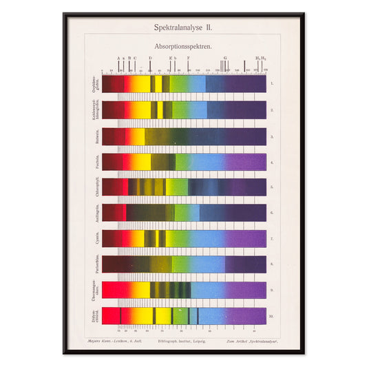
Spectral Analysis Poster
The Institute of Liepzig · 1973 · Vibrant spectral bars poster echoing lab charts with crisp scientific geometry
Poster from €9 · Framed from €16
Regular price From €6,00Regular price -
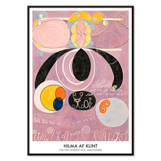
The Ten Largest, No. 6 Poster
Hilma af Klint · 1907 · Radiant abstract poster of swirling forms and symbols in soft pinks and purples
Poster from €9 · Framed from €16
Regular price From €6,00Regular price -
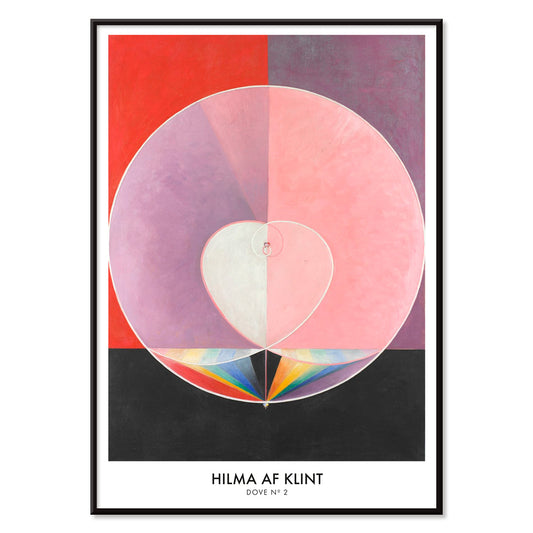
Doves No. 2 Poster
Hilma af Klint · 1915 · Lyrical abstract art print with dove symbolism and pastel-toned geometric forms
Poster from €9 · Framed from €16
Regular price From €6,00Regular price -
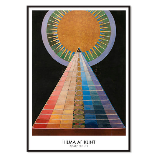
Altarpiece No. 1 Poster
Hilma af Klint · 1915 · Radiant geometric art print featuring a central sun motif and bold shapes on black
Poster from €9 · Framed from €16
Regular price From €6,00Regular price -
Farbstudien, 10 Blätter IV Poster
Karl Wiener · 1923 · Luminous abstract watercolor art print with layered color fields in blue, purple, and yellow
Poster from €9 · Framed from €16
Regular price From €6,00Regular price -
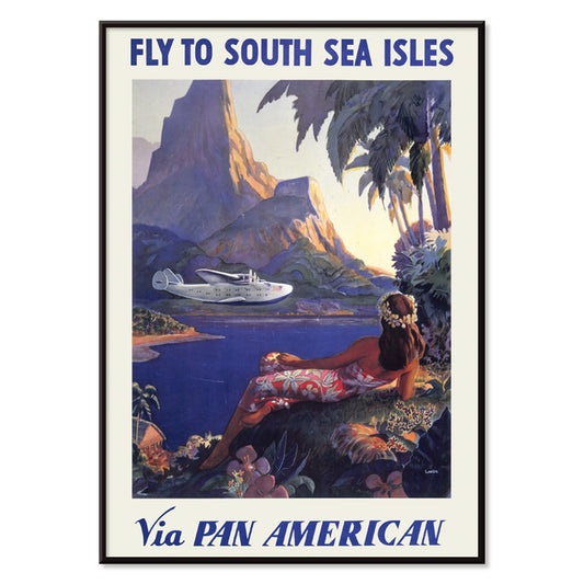
Fly to South Sea isles via Pan American Poster
Paul George Lawler · 1938 · Vibrant South Sea Isles travel poster with Pan Am seaplane and tropical shoreline
Poster from €9 · Framed from €16
Regular price From €6,00Regular price -
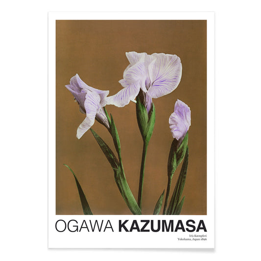
Iris Kæmpferi Poster
Ogawa Kazumasa · 1896 · Hand-colored iris botanical print with slender green leaves and soft purple petals
Poster from €9 · Framed from €16
Regular price From €6,00Regular price -
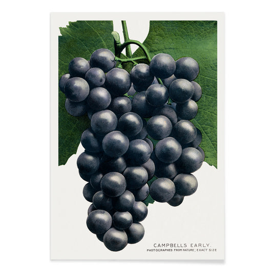
Campbell's Early Grape Poster
Rochester Lithographing and Printing Company · 1895 · Lush botanical print of purple grape clusters framed by crisp green vine leaves
Poster from €9 · Framed from €16
Regular price From €6,00Regular price


72/97 items
- Faun and Nymphe Poster
- The Dream Poster
- Visit Puerto Rico Poster
- Butter Poster
- Ecchu Umidani Pass Poster
- The green tree library Poster
- Atlas of the Munsell color system Poster
- Adelaster Albivenis Poster
- Flower Market - Mumbai Poster
- Flower Market - Kyoto Poster
- Flower Market - Dehli Poster
- Flower Market - Cape Town Poster
- Flower Market - Cardiff Poster
- Flower Market - Seoul 2 Poster
- Flower Market - Sao Paulo Poster
- Flower Market - Rome Poster
- Flower Market - Milano Poster
- Flower Market - Berlin Poster
- Flower Market - Amsterdam Poster
- Flower Market Columbia Road Poster
- Japanese Toys 2 Poster
- Shinobazu pond Poster
- The Theory and Practice of Color Poster
- Green Vegetables and herbs Poster
- Métamorphose du violon Poster
- Bauhaus Poster 11 Poster
- Bauhaus Poster 10 Poster
- Faust , tragédie de Goethe Poster
- Farbstudien, 10 Blätter IX Poster
- Farbstudien, 10 Blätter VIII Poster
- Randy Brecker Quintet Poster
- Nothing like a good book Poster
- Familiar colors Poster
- The Charm of Color Poster
- Fly to the Caribbean Poster
- Vintage floral patterns Poster
- Flower art deco pattern 11 Poster
- The Chromatic scale of colors Poster
- Iriartea Ventricosa Poster
- Composition Poster
- A woman holds flowers Poster
- Cigarrillos Paris Poster
- Spectral Analysis Poster
- The Ten Largest, No. 6 Poster
- Doves No. 2 Poster
- Altarpiece No. 1 Poster
- Farbstudien, 10 Blätter IV Poster
- Fly to South Sea isles via Pan American Poster
A Color That Thinks in Shadows
Purple behaves like dusk in interior decoration: it deepens neutrals, cools bright whites, and makes brass read warmer. In the history of the vintage poster and art print, violet also signals modern chemistry and modern taste, from late nineteenth-century inks to mid-century screen processes. This selection gathers posters and wall art where purple appears as pigment, twilight, or a single accent note, moving between floral studies, symbolist reverie, and studio-style diagrams. For nearby palettes, it pairs naturally with Black & White contrast, the open air of Landscape scenes, and the quiet structure of Minimalist compositions.
From Secession Ornament to Visionary Abstraction
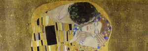
Gustav Klimt used pattern as atmosphere, and violet shadows help hold his surfaces together. In The Kiss (1907–1908) by Gustav Klimt, the gold mosaic reads like textile and icon at once, while the surrounding purples keep the embrace grounded rather than sugary. Hilma af Klint treats purple less as mood than as a register of thought: The Ten Largest, No. 6 (1907) by Hilma af Klint uses lilac and violet as structural cues, guiding the eye through spirals, seed forms, and annotated curves. This lineage connects easily to the symbolic undercurrents in Esoteric imagery and the lyrical experiments of Abstract art.
Where Purple Works at Home
Purple is most convincing when it operates as an accent rather than a single-note statement. In a bedroom, a violet-heavy poster above stone, oat, or chalk textiles reads calm without turning sweet; in a living room, it negotiates between walnut, bouclé, chrome, and smoked glass. It also flatters greenery: place a purple print near terracotta pots or dried grasses, then echo the hue with one plum cushion or a muted rug detail. If you want the color to feel botanically anchored, hang it near plates from Botanical studies; if you prefer sharper rhythm, let it sit beside strict geometry from Bauhaus.
Modernist Color Lessons You Can Live With
Some works here feel like studio notes turned into wall art, where hue is both subject and method. Robert Delaunay’s Composition (1930) by Robert Delaunay stacks circular intervals of plum, emerald, and lemon to create depth without traditional perspective. Albert Henry Munsell goes the other way: Atlas of the Munsell color system Pl.01 (1915) by Albert Henry Munsell maps color with measured clarity, useful in a studio corner, kitchen, or hallway where you want structure. For related graphic sensibilities, the wit of Advertising posters and the measured diagrams of Science prints keep purple from drifting into pure romance.
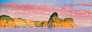
Curating Dusk, Distance, and Paper
To keep violet from feeling precious, combine it with scenes that carry weather and space. Ecchu Umidani Pass (1923) by Kawase Hasui offers indigo quiet and a single lantern glow, linking the palette to Japanese printmaking and the broader language of Oriental works. In framing, purple rewards breathing room: a pale mat clarifies lilac tones, while a walnut or black frame gives aubergine weight. Mixing one horizontal piece with a smaller vertical print keeps a gallery wall paced rather than symmetrical, letting the color appear, recede, and return like evening light.