


You may also like
-
The Chromatic scale of colors Poster
Marcius Willson · 1890 · Meticulously labeled chromatic color wheel poster with crisp geometry and vivid spectrum
Poster from €9 · Framed from €16
Regular price From €6,00Regular price -
Forms of leaves Poster
Marcius Willson · 1890 · Educational leaf anatomy print with labeled forms and gentle green botanical tones
Poster from €9 · Framed from €16
Regular price From €6,00Regular price -
Economical use of plants Poster
Marcius Willson · 1865 · Detailed botanical chart poster mapping practical plant uses in crisp labeled vignettes
Poster from €9 · Framed from €16
Regular price From €6,00Regular price -
Peinture et Teinture Poster
Claude Augé · 1908 · Educational color chart poster pairing French labels with orderly pigment swatches
Poster from €9 · Framed from €16
Regular price From €6,00Regular price


-

"Very nice Posters. The quality is amazing and we received it very quickly !"
-

"A shop to visit absolutely. Huge selection of posters. We spent more than an hour there !"
-

"Perfect to find gift. Price are very good. An they can frame and pack it on site"


About the Artist
Marcius Willson was a pioneering 19th-century educator who specialized in creating visual teaching aids that made complex ideas accessible through clear, systematic diagrams. His educational charts were part of a broader movement to enhance classroom learning with visual reference materials, reflecting the era's commitment to structured, universal education. Willson’s work contributed to the development of visual literacy, helping both teachers and students engage with new ways of understanding knowledge.
His charts were widely used in schools and homes, supporting the idea that learning could be both practical and visually engaging. Willson’s legacy endures in the history of educational design, where clarity and function were valued above ornamentation.
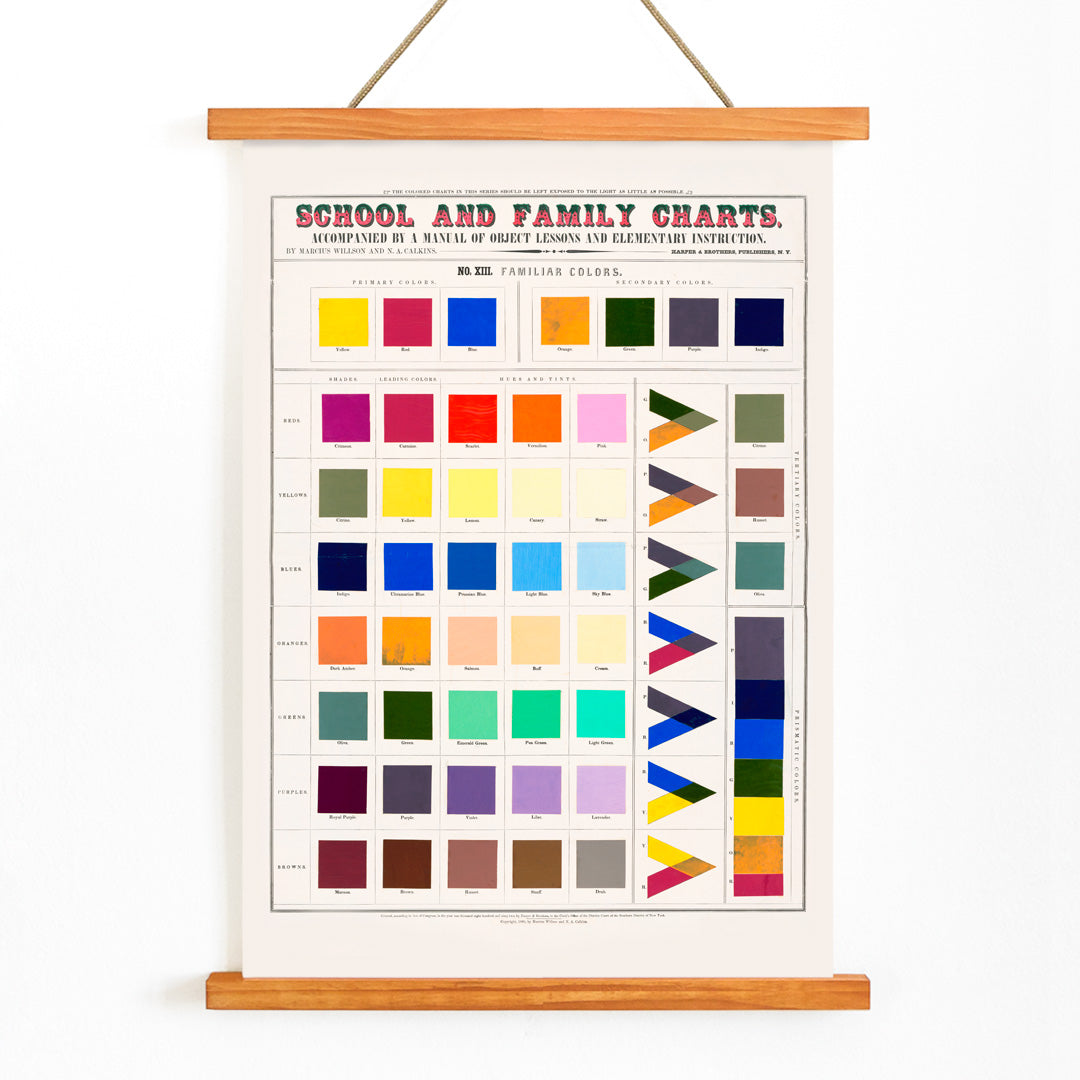
The Artwork
This color chart was produced as part of Willson’s School and Family Charts series, at a time when color recognition was considered an essential part of modern education. The chart provided a practical tool for teaching children to identify, name, and compare colors, integrating visual training with other foundational subjects like reading and science.
In late 19th-century classrooms, such aids were used to support object lessons and foster observational skills. Today, this piece stands as both a testament to educational heritage and a striking example of early graphic design, making it a natural companion to science posters and other vintage educational prints.
Style & Characteristics
The chart features a precise geometric arrangement of colored squares and triangles, each rendered in vivid tones of red, blue, yellow, green, orange, pink, and purple. The systematic layout emphasizes clarity and order, creating a rhythmic visual effect that feels both instructional and modern.
The use of pure, unblended hues and the strong grid structure anticipate later design movements, appealing to admirers of Bauhaus inspired posters and abstract prints. The overall mood is bright and energetic, with a focus on visual clarity and educational purpose.
In Interior Design
This vintage color chart poster adds a lively, intellectual touch to spaces like home offices, studios, playrooms, or educational corners. Its bold palette pairs well with minimalist decor, light woods, and neutral backgrounds, allowing the colors to stand out.
For a cohesive look, echo one or two of the chart’s hues in surrounding textiles or accessories. Especially suited for designers, educators, and families, it also complements kids wall art for a timeless, thoughtful atmosphere.