




-

"Very nice Posters. The quality is amazing and we received it very quickly !"
-

"A shop to visit absolutely. Huge selection of posters. We spent more than an hour there !"
-

"Perfect to find gift. Price are very good. An they can frame and pack it on site"


About the Artist
Arlington Gregg name is tied to a practical 1936 commission for the Illinois WPA Art Project: a public message asking readers to keep rain away from books. Rather than presenting a lecture, the project gave this reminder the concise force of a vintage poster, allowing book care to enter everyday civic communication. Gregg contribution is less about personal biography than about translating a useful instruction into recognizable American graphic design. That purpose gives the Arlington Gregg art print a clear historical identity: wall art with a public-service origin, made when the WPA used visual culture to connect information with ordinary routines.
The Artwork
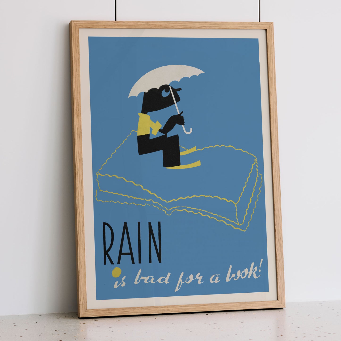
A wet day supplies the entire premise: a book, unlike a person, cannot simply wait outside for the weather to pass. The exclamation in Rain Is Bad for a Book! turns that practical fact into a friendly warning rather than a reprimand. Created for the Illinois WPA Art Project in 1936, the poster appears to have served an educational or public-information purpose. Its message remains easy to understand: protect shared reading material from water. As a vintage print, it preserves a small piece of New Deal-era communication, where useful advice could take the form of accessible wall art.
Style & Characteristics
Blue dominates the field, giving the vertical poster a quiet ground for the figure and lettering. A black figure holds a yellow book beneath a cream umbrella, while a curved handle drops toward the lower hand. Below it, a large open volume is drawn in thin, irregular yellow lines that ripple across the blue. The tall black RAIN lettering anchors the lower left, and cream handwritten script carries the rest of the title. Small yellow marks punctuate the lettering. This minimalist graphic language makes the vintage poster feel witty without relying on detail. As a fine art print, it brings typographic contrast to wall art inspired by 1930s graphic design.
In Interior Design
In a study, frame the vertical poster above a writing desk, letting its blue field support the room quiet routines. The black border would echo the narrow lettering, while the cream umbrella picks up the pale mat around the image. A single yellow detail in the room, such as a desk lamp, could answer the book outline without competing with it. From a seated distance, the large RAIN title reads quickly; closer viewing reveals the hand-drawn title and the improbable scale of the open volume. This fine art print brings vintage home decor a literary subject with a dry visual joke, while its restrained palette keeps the interior decoration focused.