
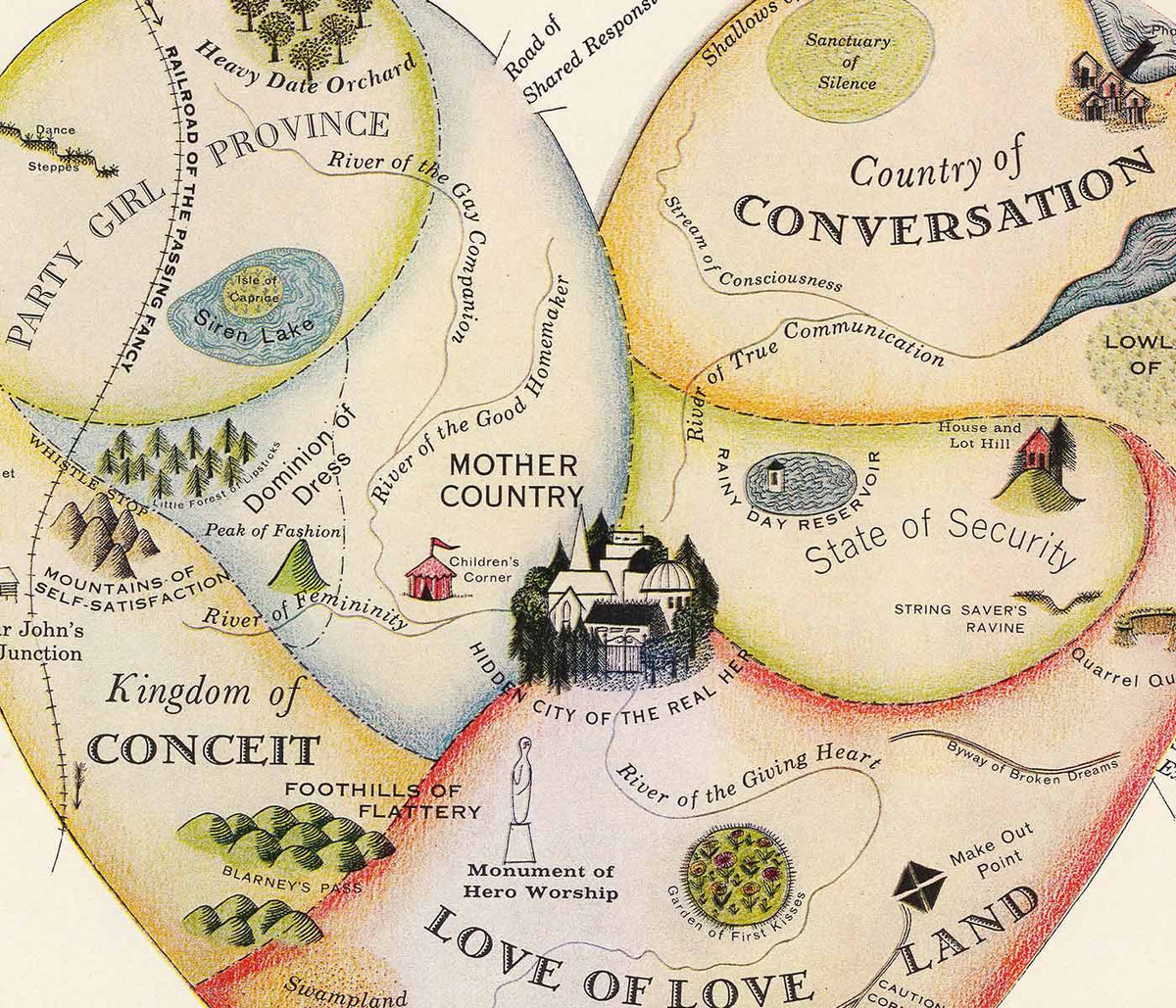


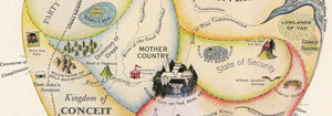


- Geographical Guide to a Woman's Heart Poster
- Flower Market Lisbon Poster
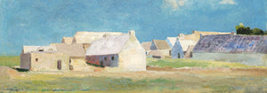
- Lisbon Azulejo 1 Poster
- Lisbon Azulejo 2 Poster
- Lisbon Tramway 28 Poster
- Minimalist Lisbon Map Poster
- Lisbon Bridge Poster
- Save the whales Poster
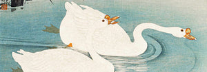
- Blue Japanese Crane Poster
- Portugal Today Poster
- 25th of April Bridge Poster
- The New Yorker Poster
- Flower Market Barcelona Poster
- Beer and Cigarette Poster
- Zoologischer Garten Poster
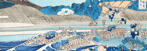
- Kanagawa Great Wave Poster
- Porto Ramos-Pinto Poster
- Snoopy come home Poster
- The Floor of the Oceans Poster
- Babar en Voiture Poster
- Campari Soda Poster
- Wake up and read Poster
- Black Cat 2 Poster
- Grands Prix de France Poster
- Sigmund Freud had it Poster
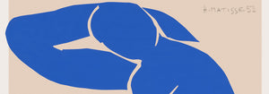
- Matisse Dancing Figures Poster
- The Tricolor balloon Poster
- Nu Bleu III Poster
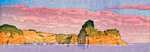
- Pink sky Poster
- Le Voyage de Babar Poster
- Marihuana Poster
- Solaris Poster
- Panther Poster
- Coffea Arabica 3 Poster
- Cordial Campari Poster
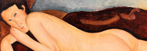
- The Dream Poster
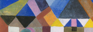
- Papiers découpés 3 Poster
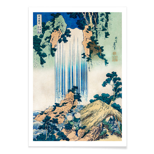
- The Tiger of Ryōkoku Poster
- Papiers découpés 1 Poster
- The Great Wave Poster
- Minimalist Map of Barcelona Poster
- Loquats (Eriobotrya Japonica) Poster
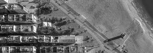
- Surfers in Venice Beach Poster
- Barcelona Text poster Poster
- Bleu de Ciel Poster
- Daybreak over Lake Yamanaka Poster
- Black Cat 4 Poster
- Photographic camera patent Poster
- Drink Coca Cola Poster
- Lisbon Old City 2 Poster
-
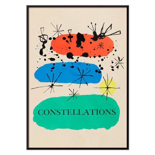
Constellations Poster
Joan Miró · 1941 · Dreamlike constellation poster with playful stars and biomorphic symbols in bright primary tones
Poster from €9 · Framed from €16
Regular price From €6,00Regular price -
Colorful flower pattern Poster
Owen Jones · 1867 · Vibrant floral poster with rhythmic Victorian ornament and crisp, repeating symmetry
Poster from €9 · Framed from €16
Regular price From €6,00Regular price -
Green Botanical pattern Poster
Owen Jones · 1867 · Victorian botanical print with rhythmic green foliage and bright floral accents
Poster from €9 · Framed from €16
Regular price From €6,00Regular price -
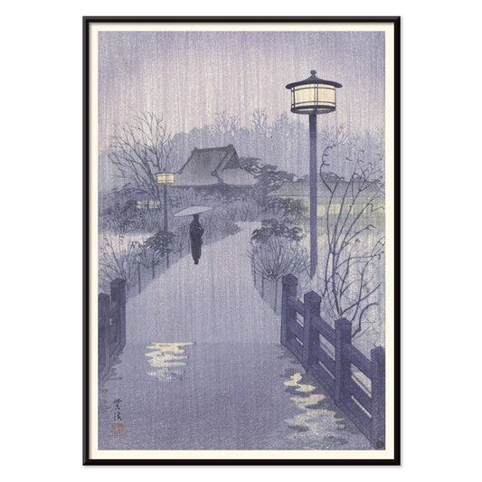
Shinobazu pond Poster
Kasamatsu Shirô · 1938 · Rainy evening art print of Shinobazu Pond with a solitary walker and reflections
Poster from €9 · Framed from €16
Regular price From €6,00Regular price -
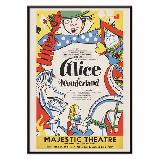
Alice in Wonderland Poster
Artcraft Lithograph · 1947 · Whimsical Alice in Wonderland poster with bold mid-century theater lettering and storybook charm
Poster from €9 · Framed from €16
Regular price From €6,00Regular price -
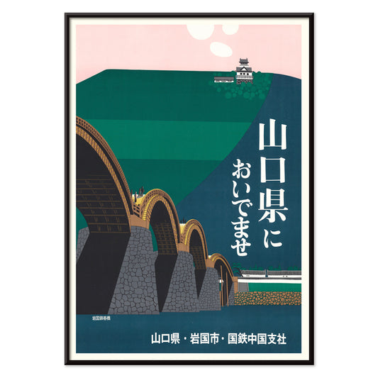
Iwakuni City Poster
Japan National Railways · 1960 · Serene travel poster of Kintai Bridge arches leading to a hilltop castle
Poster from €9 · Framed from €16
Regular price From €6,00Regular price -
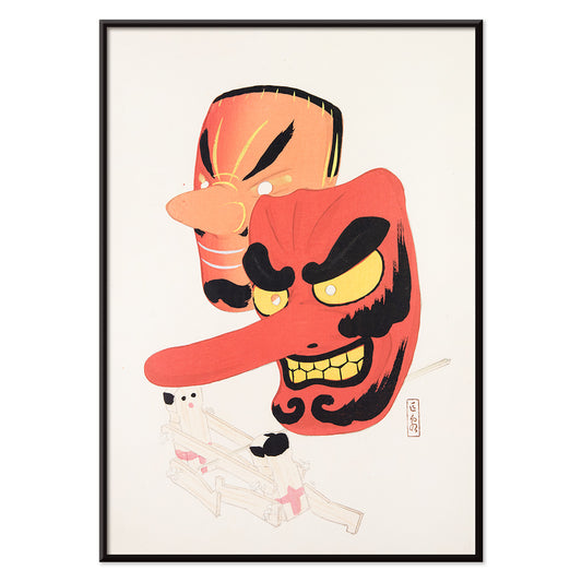
Japanese Toys 1 Poster
Kawasaki Kyosen · 1919 · Playful festival mask vintage print with bold lines and cheerful folk character
Poster from €9 · Framed from €16
Regular price From €6,00Regular price -
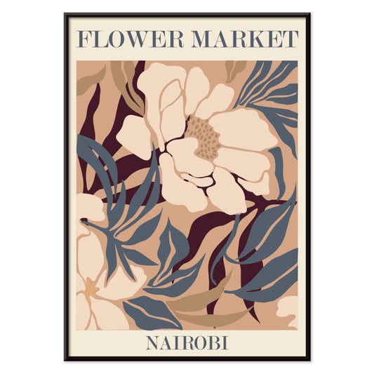
Flower Market - Nairobi Poster
MORYARTY · 2019 · Abstract floral art print in beige, brown, and blue with market energy
Poster from €9 · Framed from €16
Regular price From €6,00Regular price -
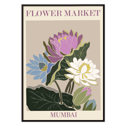
Flower Market - Mumbai Poster
MORYARTY · 2022 · Vibrant water lily poster evoking Mumbai flower market blooms in purple, green, and blue
Poster from €9 · Framed from €16
Regular price From €6,00Regular price -
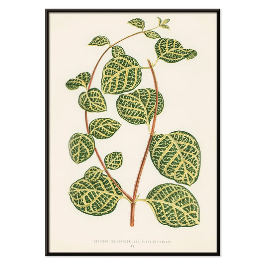
Lonicera Brachypoda Poster
Shirley Hibberd · 1855 · Elegant botanical print of honeysuckle foliage and blossoms on warm beige paper
Poster from €9 · Framed from €16
Regular price From €6,00Regular price -
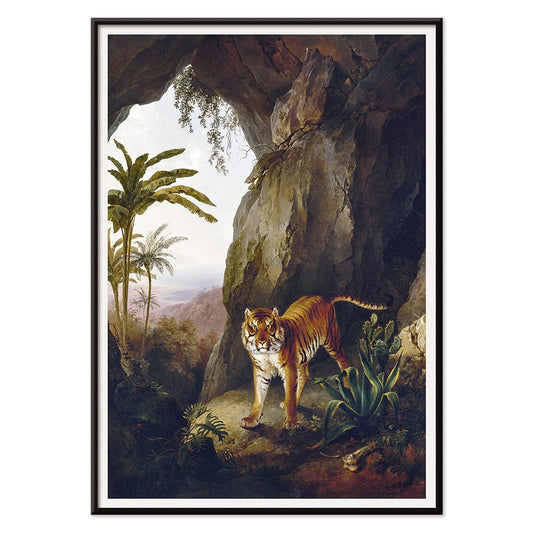
Tiger in a Cave Poster
Jacques–Laurent Agasse · 1814 · Majestic tiger art print resting in shadowed cave with sunlit foliage
Poster from €9 · Framed from €16
Regular price From €6,00Regular price -
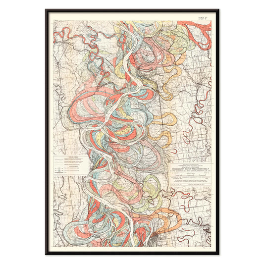
Courses of the Mississippi River Poster
Harold Fisk · 1946 · Flowing river-course map poster with layered meanders in bright reds, blues, and greens
Poster from €9 · Framed from €16
Regular price From €6,00Regular price -
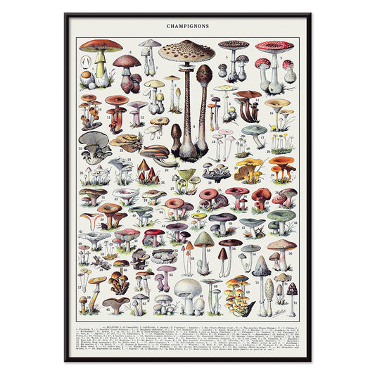
Mushrooms colour plate 2 Poster
Larousse · 1932 · Detailed mushroom print arranged like a field guide plate on warm cream paper
Poster from €9 · Framed from €16
Regular price From €6,00Regular price -
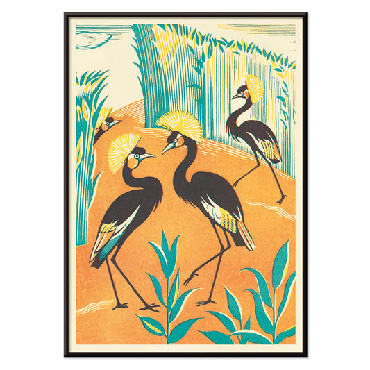
A Jungle Picnic 15 Poster
Clifford Webb · 1934 · Stylized jungle birds poster featuring elegant cranes amid lush green foliage
Poster from €9 · Framed from €16
Regular price From €6,00Regular price -
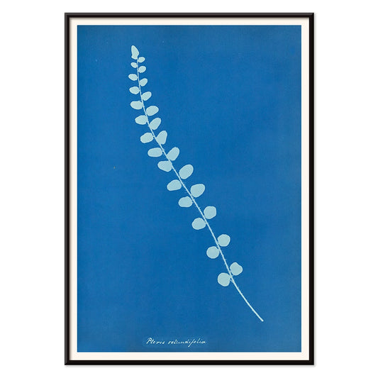
Pteris rotundifolia Poster
Anna Atkins · 1850 · Luminous cyanotype botanical print of a fern frond with airy, lace-like detail
Poster from €9 · Framed from €16
Regular price From €6,00Regular price -
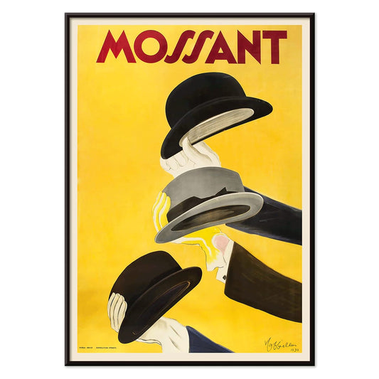
Mossant Poster
Leonetto Cappiello · 1938 · Striking hat advertising poster featuring three raised hands and bold color contrast
Poster from €9 · Framed from €16
Regular price From €6,00Regular price -
Broad Peak Poster
Vittorio Sella · 1909 · Dramatic black and white mountain art print with cloud-wrapped summit and deep shadows
Poster from €9 · Framed from €16
Regular price From €6,00Regular price -
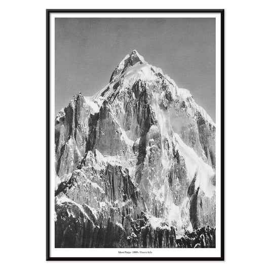
Le mont Paitju Poster
Vittorio Sella · 1909 · Dramatic black-and-white mountain poster capturing Mont Paitju in crisp alpine light
Poster from €9 · Framed from €16
Regular price From €6,00Regular price -
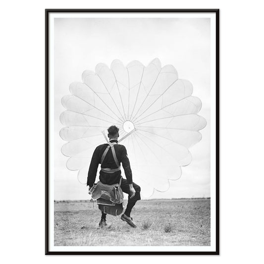
Air Force Parachuter Poster
Ray Olsen · 1939 · Dramatic aviation poster of a descending parachuter set against stark skyward geometry
Poster from €9 · Framed from €16
Regular price From €6,00Regular price -
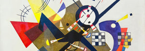
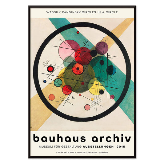
Circles in a circle Poster
Wassily Kandinsky · 1923 · Radiant abstract poster of layered circles floating on a deep black field
Poster from €9 · Framed from €16
Regular price From €6,00Regular price -
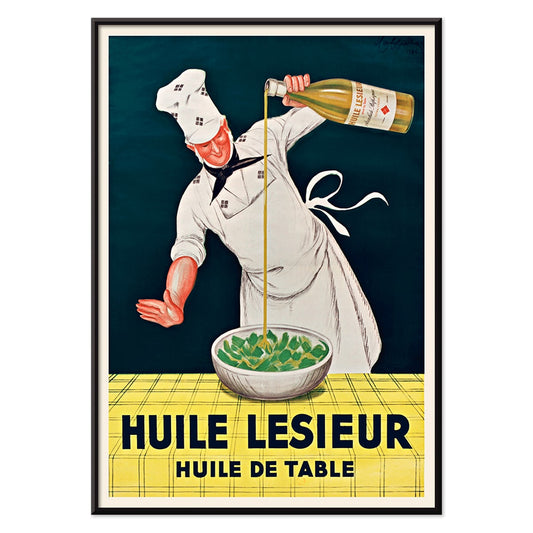
Huile Lesieur Poster
Leonetto Cappiello · 1930 · Spirited chef advertising poster pouring golden oil with bold red type on black background
Poster from €9 · Framed from €16
Regular price From €6,00Regular price -
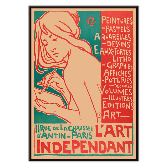
L'Art Independant Poster
Emile Berchmans · 1915 · Art Nouveau poster of a female artist with flowing lines and bold red details
Poster from €9 · Framed from €16
Regular price From €6,00Regular price -
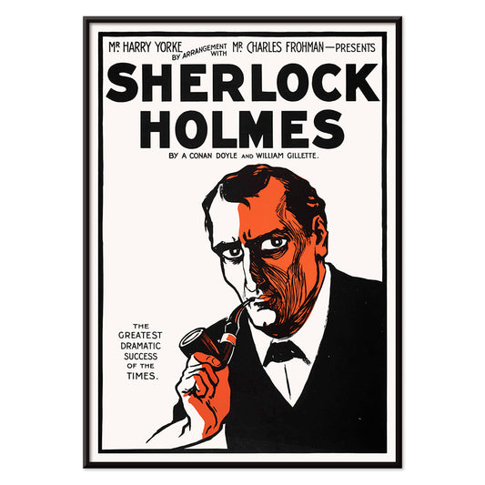
Sherlock Holmes Poster
Unknown artist · 1901 · Dramatic Sherlock Holmes poster featuring pipe and deerstalker in stark black, white, orange
Poster from €9 · Framed from €16
Regular price From €6,00Regular price -
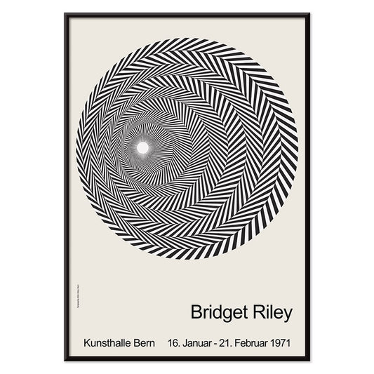
Riley Blaze Poster
Bridget Riley · 1964 · Hypnotic black and white Op Art poster with curving bands that seem to pulse
Poster from €9 · Framed from €16
Regular price From €6,00Regular price -
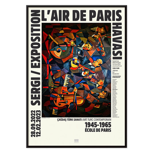
Le Concert Poster
Hulusi Mercan · 1960 · Energetic abstract poster of musical instruments with bold red blue and yellow shapes
Poster from €9 · Framed from €16
Regular price From €6,00Regular price -
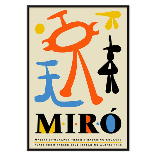
Parler Seul 2 Poster
Joan Miro · 1948 · Playful biomorphic poster with floating black lines and orange, blue, yellow accents on beige
Poster from €9 · Framed from €16
Regular price From €6,00Regular price -
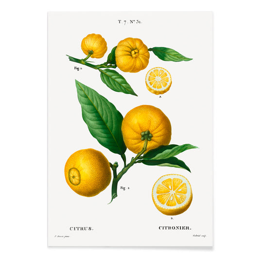
Citrus Poster
Pierre-Joseph Redouté · 1810 · Delicate citrus botanical print with ripening fruit, blossoms, and glossy leaves on cream
Poster from €9 · Framed from €16
Regular price From €6,00Regular price -
Violet Poster
Wassily Kandinsky · 1923 · Geometric abstract art print with violet, blue, and yellow shapes on pale ground
Poster from €9 · Framed from €16
Regular price From €6,00Regular price -
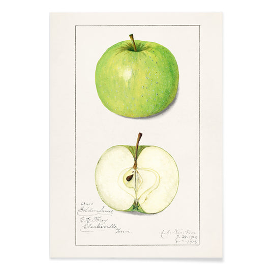
Malus Domestica Poster
Amanda Almira Newton · 1913 · Delicate apple botanical print with whole fruit, leafy stem, and a sliced cross section
Poster from €9 · Framed from €16
Regular price From €6,00Regular price -
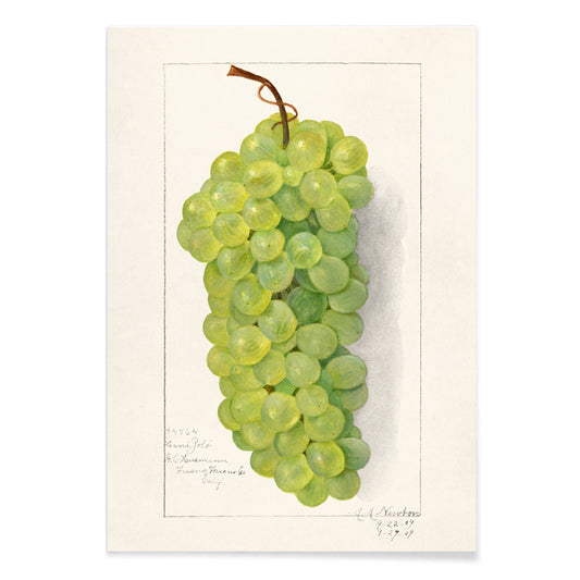
Bunch of green grapes Poster
Amanda Almira Newton · 1896 · Delicate botanical print of green grapes with translucent skins and soft shadowing
Poster from €9 · Framed from €16
Regular price From €6,00Regular price -
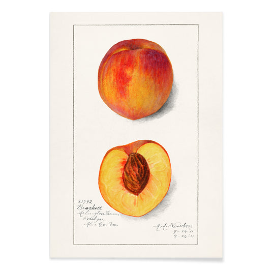
Prunus Persica Poster
Amanda Almira Newton · 1911 · Delicate peach botanical print with ripening fruit and soft leaves on white ground
Poster from €9 · Framed from €16
Regular price From €6,00Regular price -
Yoro Waterfall Poster
Katsushika Hokusai · 1832 · Iconic Japanese vintage print of Yoro Waterfall with sweeping cascade and quiet mountain setting
Poster from €9 · Framed from €16
Regular price From €6,00Regular price -
Prunus Domestica Poster
Amanda Almira Newton · 1888 · Lush plum botanical print with ripe fruit and crisp leaves on white ground
Poster from €9 · Framed from €16
Regular price From €6,00Regular price -
Diagram no.4 Poster
Hiram Erastus Butler · 1887 · Precise black-and-white solar system scientific print built from concentric rings and fine labels
Poster from €9 · Framed from €16
Regular price From €6,00Regular price -
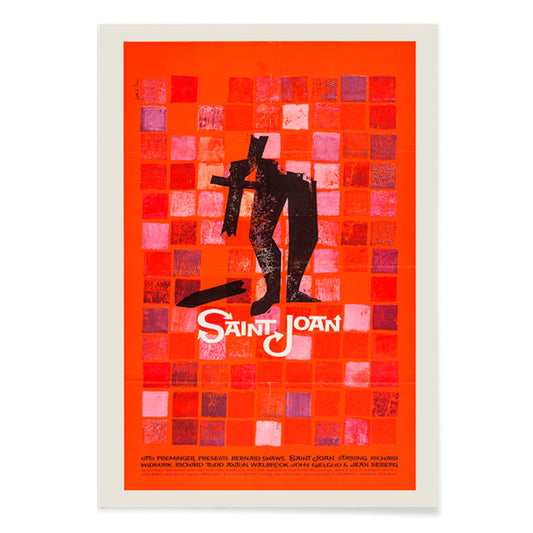
Saint Joan Poster
Saul Bass · 1957 · Iconic Saint Joan movie poster with bold red blocks and a solitary figure
Poster from €9 · Framed from €16
Regular price From €6,00Regular price -
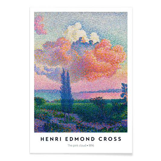
The Pink Cloud Poster
Henri-Edmond Cross · 1896 · Pointillist coastal art print with a radiant pink cloud above calm blue water
Poster from €9 · Framed from €16
Regular price From €6,00Regular price


- Constellations Poster
- Colorful flower pattern Poster
- Green Botanical pattern Poster
- Shinobazu pond Poster
- Alice in Wonderland Poster
- Iwakuni City Poster
- Japanese Toys 1 Poster
- Flower Market - Nairobi Poster
- Flower Market - Mumbai Poster
- Lonicera Brachypoda Poster
- Tiger in a Cave Poster
- Courses of the Mississippi River Poster
- Mushrooms colour plate 2 Poster
- A Jungle Picnic 15 Poster
- Pteris rotundifolia Poster
- Mossant Poster
- Broad Peak Poster
- Le mont Paitju Poster
- Air Force Parachuter Poster
- Circles in a circle Poster
- Huile Lesieur Poster
- L'Art Independant Poster
- Sherlock Holmes Poster
- Riley Blaze Poster
- Le Concert Poster
- Parler Seul 2 Poster
- Citrus Poster
- Violet Poster
- Malus Domestica Poster
- Bunch of green grapes Poster
- Prunus Persica Poster
- Yoro Waterfall Poster
- Prunus Domestica Poster
- Diagram no.4 Poster
- Saint Joan Poster
- The Pink Cloud Poster
What bestseller means for a vintage poster wall
In a vintage poster collection, bestsellers are less about noise than recognition: images that keep earning a second glance. This selection reads like a map of shared instinct, where graphic punch and quiet atmosphere coexist. Travel vistas, botanical studies, and clean abstraction rise because they bring quick structure to a room. For a broader view of themes that feed these favourites, see Advertising, Landscape, and Abstract.
Why certain images return again and again
Many popular prints solve a compositional problem with unusual efficiency. A strong silhouette lands faster than detail; a limited palette travels further across a room; typography can act like architecture, setting a baseline for everything around it. The street-poster tradition, with flat colour and compressed perspective, explains why advertising graphics stay legible at distance. The measured rhythm of Bauhaus reinforces that logic, while figuration in Famous Artists adds a human pulse that modern interiors often lack. If you want to compare graphic density, the contrast between Black & White and colour-led sets like Blue shows how value and hue steer attention.
Placing bestsellers in real rooms
Because these images are crowd-tested, they tend to be flexible as home decor and decoration, but placement still matters. In an entryway, a vintage poster with a clear horizon line or central figure gives direction as you step inside. In a kitchen or dining nook, typography and simplified forms sit well beside enamel, chrome, and open shelving; a related edit lives in Kitchen. For bedrooms, keep contrast gentler and leave breathing space around the image so the wall art stays calm rather than busy.
Curating pairs, sequences, and frames
Start with one anchor art print, then add companions that answer it. A loud graphic sheet can be tempered by a quieter view; a spare composition can be grounded by denser lettering. Keep margins consistent to make mixed eras feel intentional, and let one recurring colour do the unifying work. Thin oak warms cool palettes, black aluminium sharpens them, and an off-white mat can slow down saturated vintage imagery. If you rotate often, framing references in Frames helps keep the wall stable while the print selection changes.
Specific works that explain the appeal
Leonetto Cappiello’s poster designs show how a single exaggerated motif can carry an entire composition, making them natural statement pieces. Kawase Hasui’s snow and night scenes demonstrate the opposite strategy: controlled gradations and open space that feel architectural when framed. For pattern-forward interiors, William Morris decorative prints bridge fine art and design history, working well beside textiles and wood. These bestsellers do not prescribe taste; they reveal reliable structures for building a gallery wall that looks lived-in rather than assembled.