


- Destroy this mad brute Poster
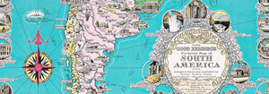
- The good neighbor of South America Poster
- Italy with Vatican City Poster
- Onions Poster
- Bec-Kina Poster
- Kohler Chocolat Poster
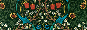
- Strawberry Thief Poster
- Tom Krojer Exhibition Poster Poster
- Ernst Kirchner Exhibition Poster
- El Comienzo Poster
- Parler Seul 2 Poster
- Twilight’s Ring Poster
- Parler Seul Poster
- Faun and Nymphe Poster
- The Dream Poster
- Le Concert Poster
- Bird passing through a Cloud Poster
- Female Artist Poster
- Revenge of the Pink Panther Poster
- Woman and Bird at Night Poster
- Bauhaus 20 Poster
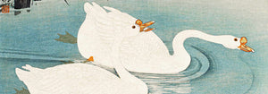
- Blue Japanese Crane Poster
- Snoopy come home Poster
- To London by Jet Clipper Poster
- Kyushu-Okinawa Poster
- Xerez Pedro Domeco Poster
- Balsam Aperitif Poster
- Butter Poster
- Crans Poster
- Monte Carlo Poster
- Beer and Cigarette Poster
- West Coast of Mexico Poster
- Rita Gaufres Poster
- Hibiscus Poster
-
A woman holds flowers Poster
Louis Rhead · 1890 · Art Nouveau perfume poster featuring a graceful woman with flowers in yellow and purple
Poster from €9 · Framed from €16
Regular price From €6,00Regular price -
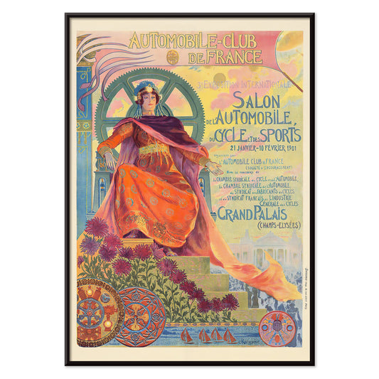
Automobile Club De France Poster
Georges Antoine Rochegrosse · 1901 · Elegant Art Nouveau poster featuring an allegorical muse with flowers and automotive gears
Poster from €9 · Framed from €16
Regular price From €6,00Regular price -
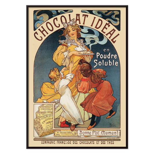
Chocolat Idéal Poster
Alphonse Mucha · 1897 · Art Nouveau chocolate poster with a serene muse and ornate floral framing
Poster from €9 · Framed from €16
Regular price From €6,00Regular price -
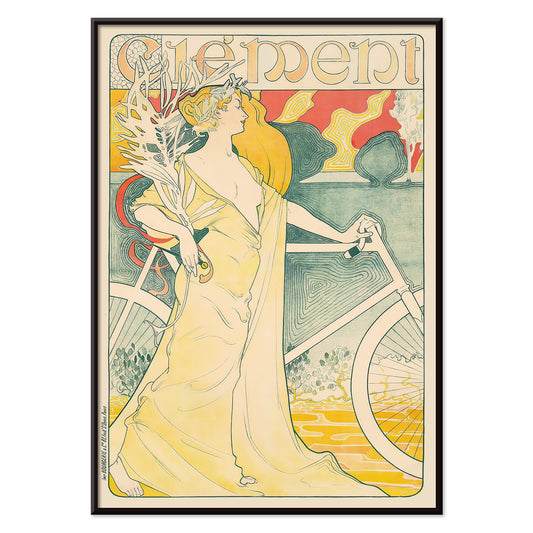
Bicycle Clément Poster
Arthur Foache · 1900 · Art Nouveau bicycle poster featuring an elegant rider and flowing gown in bright tones
Poster from €9 · Framed from €16
Regular price From €6,00Regular price -
Falbalas et fanfreluches - Orgueil Poster
George Barbier · 1925 · Art Deco fashion poster with a poised woman in bold yellow and black tones
Poster from €9 · Framed from €16
Regular price From €6,00Regular price -
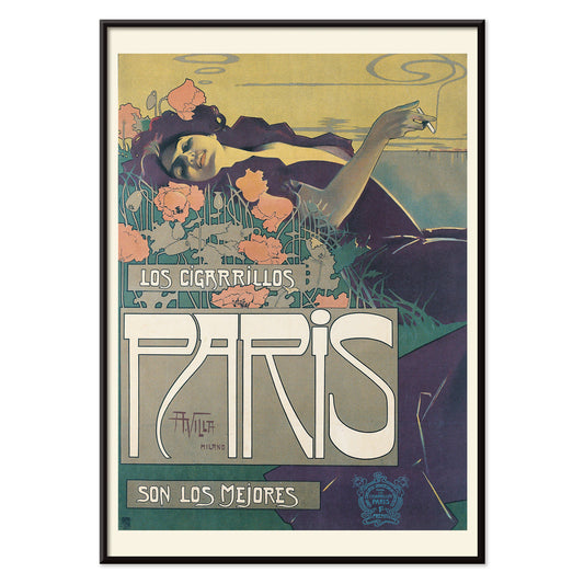
Cigarrillos Paris Poster
Aleardo Villa · 1901 · Elegant Belle Époque poster featuring a reclining woman amid pink and purple flowers
Poster from €9 · Framed from €16
Regular price From €6,00Regular price -
Elegante Pres D’une Source Poster
Georges de Feure · 1898 · Art Nouveau poster of a poised woman in an orange dress beside a spring
Poster from €9 · Framed from €16
Regular price From €6,00Regular price -
Falbalas et fanfreluches: La paresse Poster
George Barbier · 1925 · Art Deco fashion print featuring a reclining woman in bold pochoir colors
Poster from €9 · Framed from €16
Regular price From €6,00Regular price -
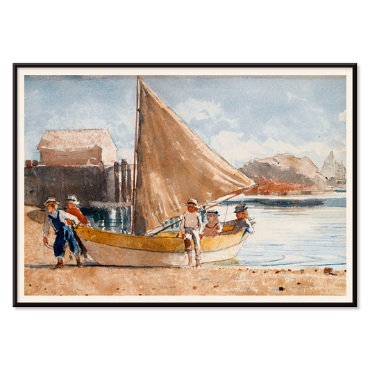
Summertime Poster
Winslow Homer · 1880 · Sunlit seaside art print of children at play along the gentle shore
Poster from €9 · Framed from €16
Regular price From €6,00Regular price -
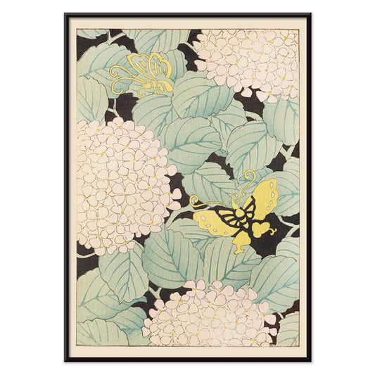
Bijutsukai Pl.169 Poster
Korin Furuya · 1901 · Delicate butterflies drift above white hydrangeas in a serene Japanese floral poster
Poster from €9 · Framed from €16
Regular price From €6,00Regular price -
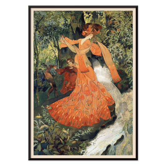
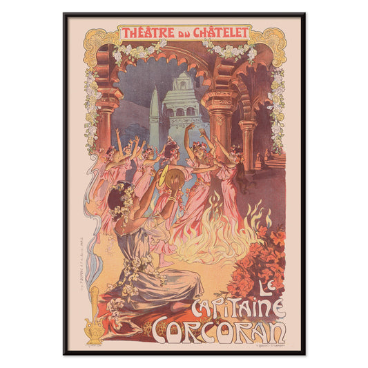
Le Capitaine Corcoran Poster
Vincent Lorant-Heilbronn · 1902 · Festive theatre poster of dancers circling a bonfire amid Art Nouveau florals
Poster from €9 · Framed from €16
Regular price From €6,00Regular price -
Bijutsukai Pl.218 Poster
Korin Furuya · 1901 · Stylized chrysanthemum poster balanced by soft geometric blocks and airy negative space
Poster from €9 · Framed from €16
Regular price From €6,00Regular price -
On the beach at Grado Poster
Eduard Otto Braunthal · 1910 · Sunlit Grado beach poster with relaxed bathers, crisp seaside blues and warm reds
Poster from €9 · Framed from €16
Regular price From €6,00Regular price -
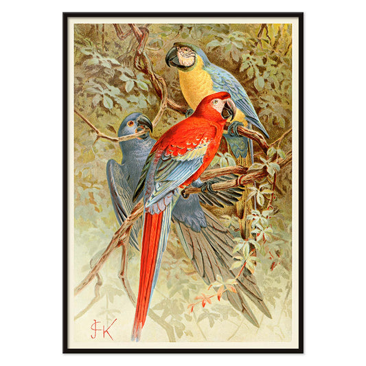
Macaws Poster
Unknown artist · 1893 · Vivid macaws print with lush rainforest foliage and crisp natural history detail
Poster from €9 · Framed from €16
Regular price From €6,00Regular price -
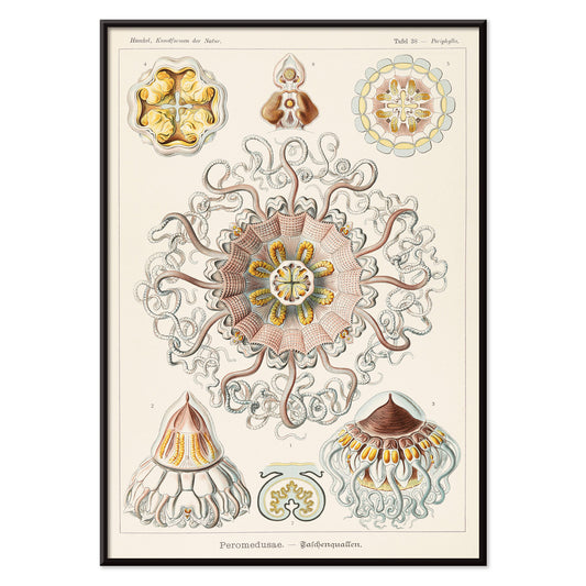
Peromedusae Poster
Ernst Haeckel · 1904 · Intricate jellyfish scientific print with floating bells and lace-like tentacles
Poster from €9 · Framed from €16
Regular price From €6,00Regular price -
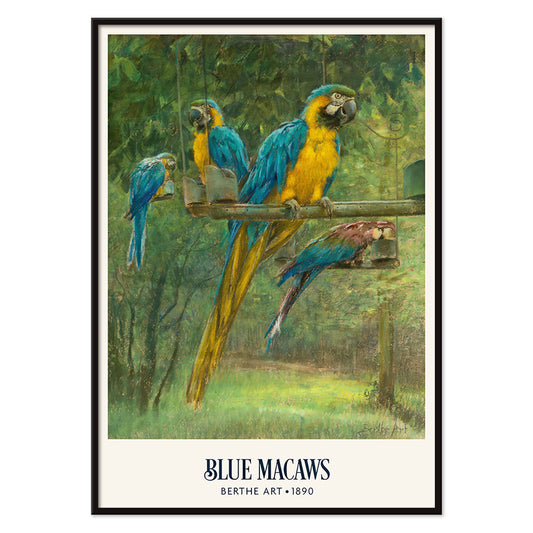
Blue Macaws Poster
Berthe Art · 1890 · Vibrant macaw poster with blue and yellow plumage amid dense tropical foliage
Poster from €9 · Framed from €16
Regular price From €6,00Regular price -
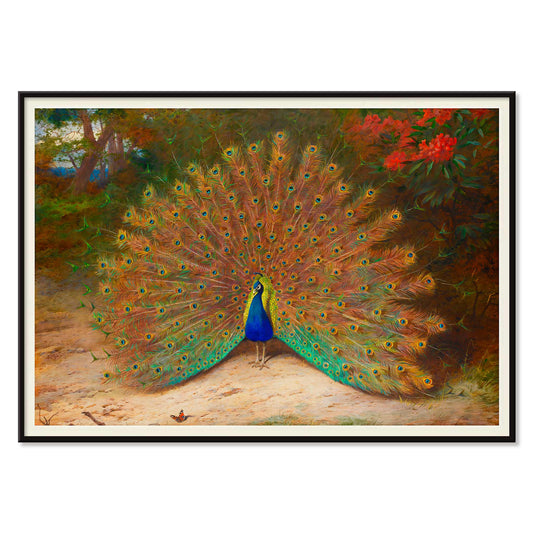
Peacock And Peacock Butterfly Poster
Archibald Thorburn · 1899 · Naturalistic peacock and butterfly print balancing jewel tones with quiet Victorian poise
Poster from €9 · Framed from €16
Regular price From €6,00Regular price -
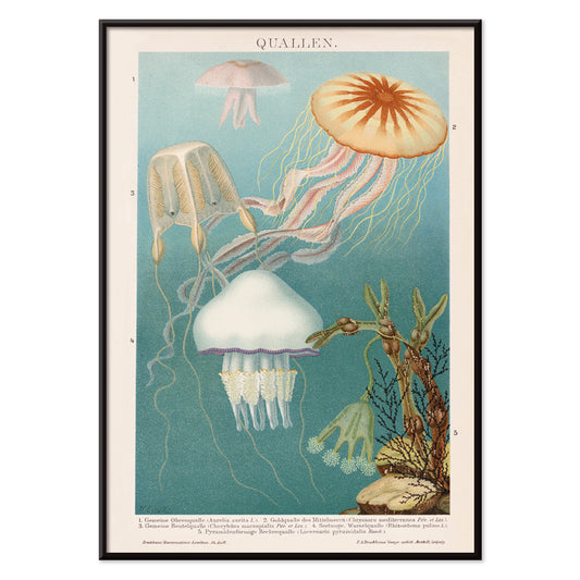
Jellyfish Poster
Institute of Liepzig · 2017 · Luminous jellyfish poster floating on deep blue with delicate trailing tentacles
Poster from €9 · Framed from €16
Regular price From €6,00Regular price -
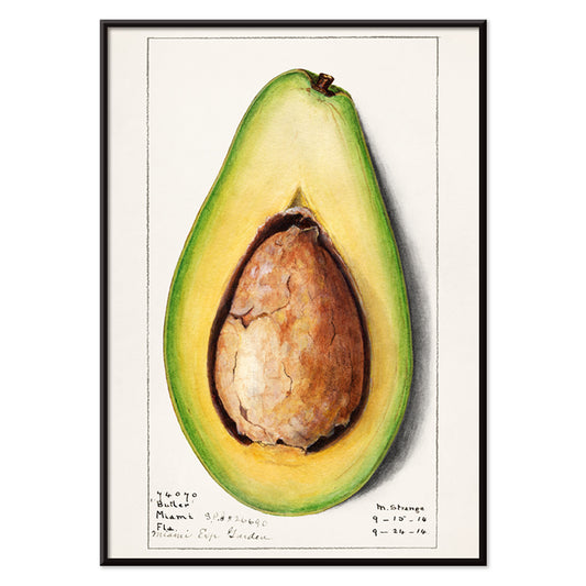
Avocado (Persea) Poster
Amanda Almira Newton · 1916 · Refined avocado botanical print with green fruit and a cut half revealing the pit
Poster from €9 · Framed from €16
Regular price From €6,00Regular price -
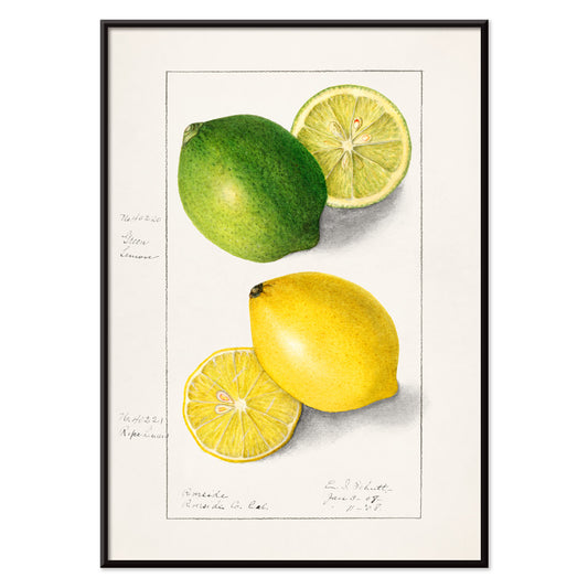
Lemons (Citrus Limon) Poster
Ellen Isham Schutt · 1908 · Luminous lemon botanical print with crisp fruit forms and fresh green foliage
Poster from €9 · Framed from €16
Regular price From €6,00Regular price -
Bael (Aegle Marmelos) Poster
Ellen Isham Schutt · 1909 · Luminous bael fruit print balancing scientific accuracy with warm tropical color
Poster from €9 · Framed from €16
Regular price From €6,00Regular price -
Avocado (Persea) Poster
Amanda Almira Newton · 1916 · Detailed avocado botanical print featuring ripe fruit halves and glossy green leaves
Poster from €9 · Framed from €16
Regular price From €6,00Regular price -
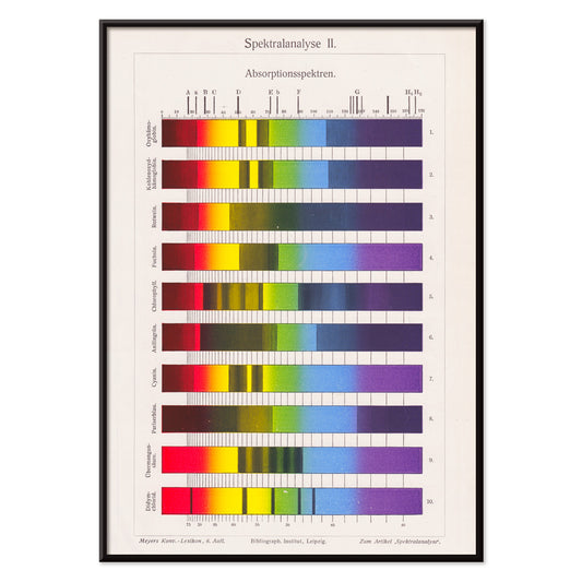
Spectral Analysis Poster
The Institute of Liepzig · 1973 · Vibrant spectral bars poster echoing lab charts with crisp scientific geometry
Poster from €9 · Framed from €16
Regular price From €6,00Regular price -
Billetes Bus Barcelona 2 Poster
Unknown artist · 1978 · Colorful Barcelona transit ticket vintage print with bold numbers and graphic accents
Poster from €9 · Framed from €16
Regular price From €6,00Regular price -
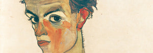
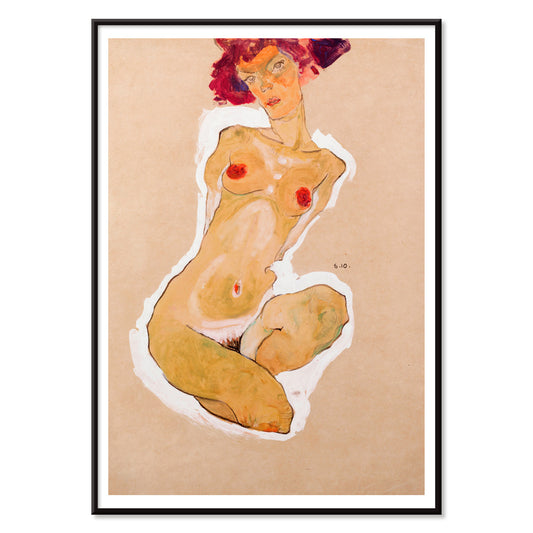
Squatting Female Nude Poster
Egon Schiele · 1910 · Taut squatting nude art print with angular pose and spare, intimate negative space
Poster from €9 · Framed from €16
Regular price From €6,00Regular price -
Billetes de Bus de Barcelona Poster
Unknown artist · 1972 · Colorful Barcelona bus ticket poster arranged as a graphic grid of transit ephemera
Poster from €9 · Framed from €16
Regular price From €6,00Regular price -
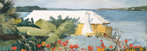
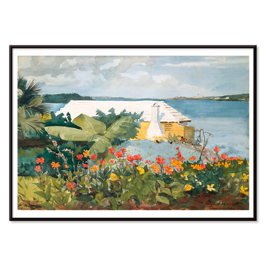
Flower Garden and Bungalow Poster
Winslow Homer · 1899 · Sunlit Bermuda garden art print with bright flowers leading to a quiet bungalow
Poster from €9 · Framed from €16
Regular price From €6,00Regular price -
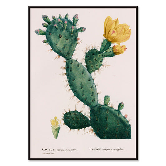
Cactus Opuntia Poster
Pierre-Joseph Redouté · 1816 · Elegant prickly pear cactus print with luminous yellow flower and crisp botanical detail
Poster from €9 · Framed from €16
Regular price From €6,00Regular price -
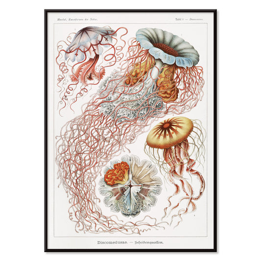
Discomedusae Poster
Ernst Haeckel · 1904 · Radiant jellyfish scientific print with translucent bells and flowing tentacles
Poster from €9 · Framed from €16
Regular price From €6,00Regular price -
Cycles Terrot Dijon 2 Poster
Nicolas Tamagno · 1900 · Classic French bicycle poster showing a touring cyclist beneath a radiant sunset
Poster from €9 · Framed from €16
Regular price From €6,00Regular price -
Cycles Perfecta Poster
Alphonse Mucha · 1897 · Art Nouveau bicycle poster with radiant muse, floral halo, and ornate lettering
Poster from €9 · Framed from €16
Regular price From €6,00Regular price -
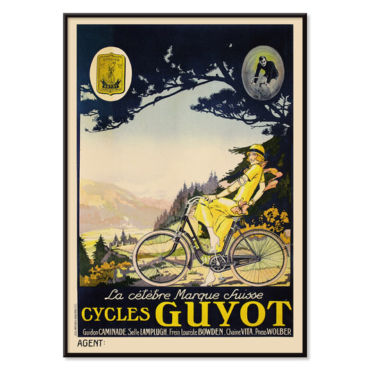
Cycles Guyot Poster
Unknown artist · 1920 · Striking cycling poster with a yellow-clad rider and bold black typography
Poster from €9 · Framed from €16
Regular price From €6,00Regular price -
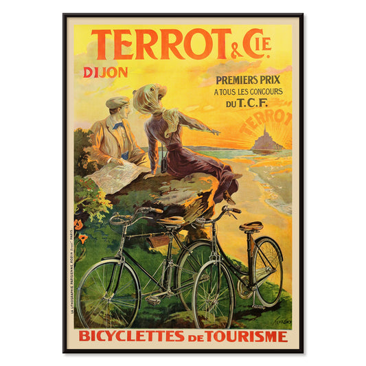
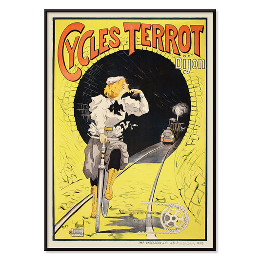
Cycles Terrot Dijon Poster
Unknown artist · 1900 · Dramatic French cycling poster showing a rider racing past a tunnel and train
Poster from €9 · Framed from €16
Regular price From €6,00Regular price -
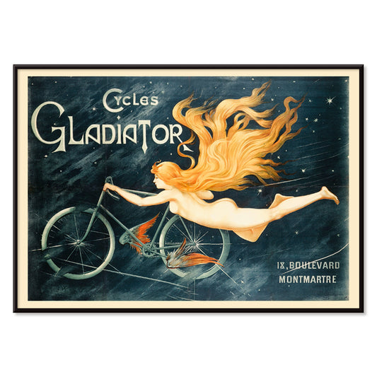
Cycles Gladiator Poster
C.B. · 1895 · Daring Art Nouveau bicycle poster featuring a triumphant rider and bold Cycles Gladiator lettering
Poster from €9 · Framed from €16
Regular price From €6,00Regular price -
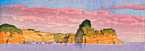
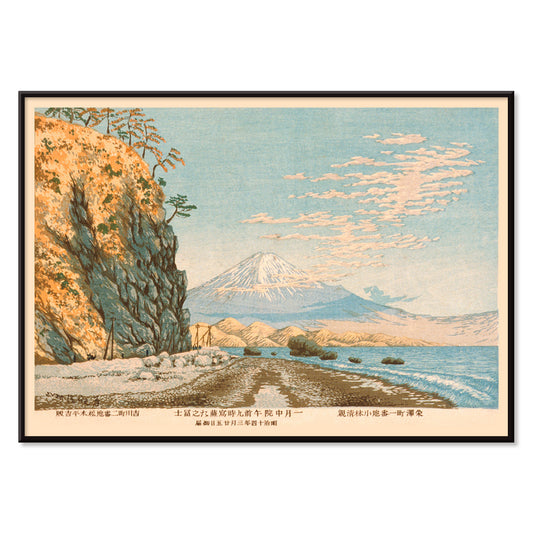
Mt. Fuji from Satta Poster
Kobayashi Kiyochika · 1881 · Serene Japanese landscape poster featuring Mt Fuji above a winding coastal road and blue sea
Poster from €9 · Framed from €16
Regular price From €6,00Regular price -
Rudge Poster
Jean de Paleologue · 1898 · Art Nouveau bicycle poster with winged muse lifting a gleaming cycle above crowds
Poster from €9 · Framed from €16
Regular price From €6,00Regular price


36/706 items
- A woman holds flowers Poster
- Chocolat Idéal Poster
- Bicycle Clément Poster
- Cigarrillos Paris Poster
- Elegante Pres D’une Source Poster
- Falbalas et fanfreluches: La paresse Poster
- Summertime Poster
- On the beach at Grado Poster
- Jellyfish Poster
- Avocado (Persea) Poster
- Lemons (Citrus Limon) Poster
- Bael (Aegle Marmelos) Poster
- Avocado (Persea) Poster
- Spectral Analysis Poster
- Squatting Female Nude Poster
- Flower Garden and Bungalow Poster
- Discomedusae Poster
- Cycles Terrot Dijon 2 Poster
- Cycles Perfecta Poster
- Cycles Gladiator Poster
- Rudge Poster
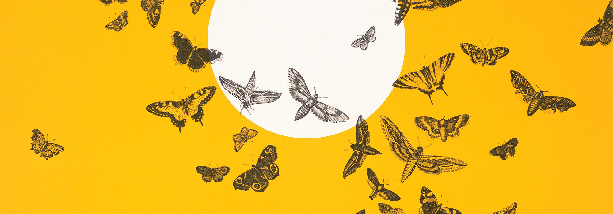
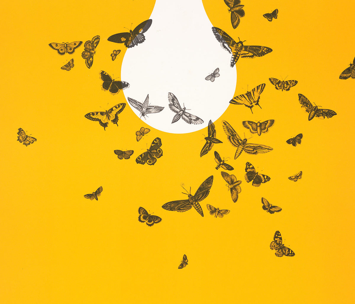
A Yellow Thread Through Art History
This collection is not about monochrome. It follows the way yellow behaves when it enters an image: as light, as warning, as ornament, as a quick lift of energy. In vintage poster culture it grabs attention from the street; in modern painting it becomes structure; in natural history it suggests pollen, rind, and sun-aged paper. Read these posters and prints as a vocabulary of warmth, from buttery highlights to sharp, electric notes that alter the temperature of wall art.
Gold, Citrus, and the Logic of Color
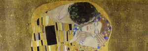
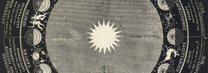
Few works show yellow as both luxury and technique as clearly as Gustav Klimt’s The Kiss (1907–1908), where metallic yellows behave like tesserae, turning paint into surface and surface into symbolism. At the opposite pole, Michel Eugène Chevreul’s Cercle chromatique treats hue as measurable information, a scientific diagram that still reads as decorative design. Together they explain why yellow persists across eras: it can signal opulence, illumination, or method, making a vintage art print feel both immediate and intellectually grounded.
Using Yellow Accents in Interior Decoration
In home decor, yellow works best when it has a job. A narrow hallway benefits from a small flare near a mirror; a kitchen welcomes yellows that feel citrus or grain-like; a study can take sharper, more analytic tones. Pair yellow posters with chalky whites, walnut, and linen for quiet warmth, or set them against deep greens and inky blues for contrast. For restraint and geometry, move between Minimalist and Abstract; for natural counterpoints, Botanical keeps the color tethered to stems, seed heads, and scientific observation.
Curating a Gallery Wall with Pattern and Structure
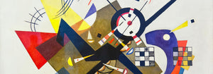
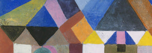
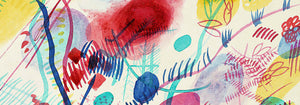
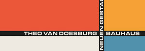
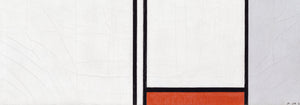
When building a gallery wall, think in rhythms: pattern, grid, then a single vivid note. William Morris’s Strawberry Thief (1883) brings textile density and a garden logic that softens modern furniture. Balance it with Piet Mondrian’s Composition in White, Red, and Yellow (1936), where yellow becomes a measured plane rather than atmosphere. Add controlled dynamism through Wassily Kandinsky’s Circles in a circle, Bauhaus exhibition (1923), a bridge between exhibition poster design and painting. To extend the mix, Advertising supports bolder typography, Bauhaus tightens the formal language, and Classic Art introduces quieter tonal anchors.
Why Yellow Feels So Present
Yellow is often dismissed as mere decoration, yet it is frequently a compositional strategy: guiding the eye, implying sunlight, or mapping a system. Hung with intention, a small yellow passage can make surrounding colors read cleaner or deeper, as if the room’s light has been adjusted without touching the lamps.